Smak Pryhod — Rebranding of a travel agency
Rebranding of a travel agency
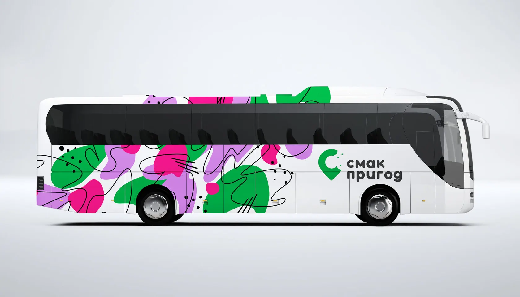
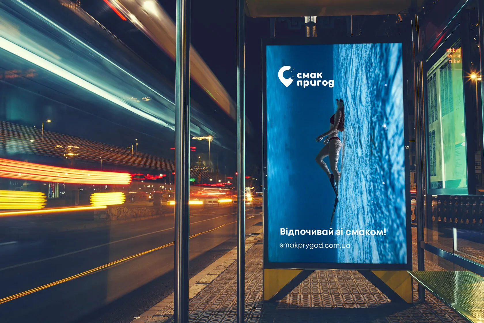
A bright brand that travels with its clients: on the bus, a backpack, a calendar and a billboard. The name means “Taste of Adventure”.
(Challenge)
Refresh the image of a travel agency so that it conveys the emotion of travel, stands out from competitors and is recognisable on the move — in the city, on the road and on social media.
(Solution)
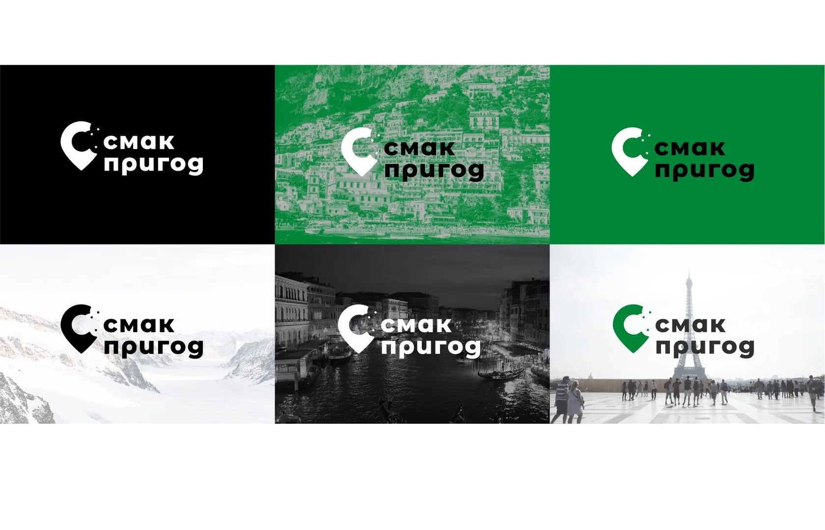
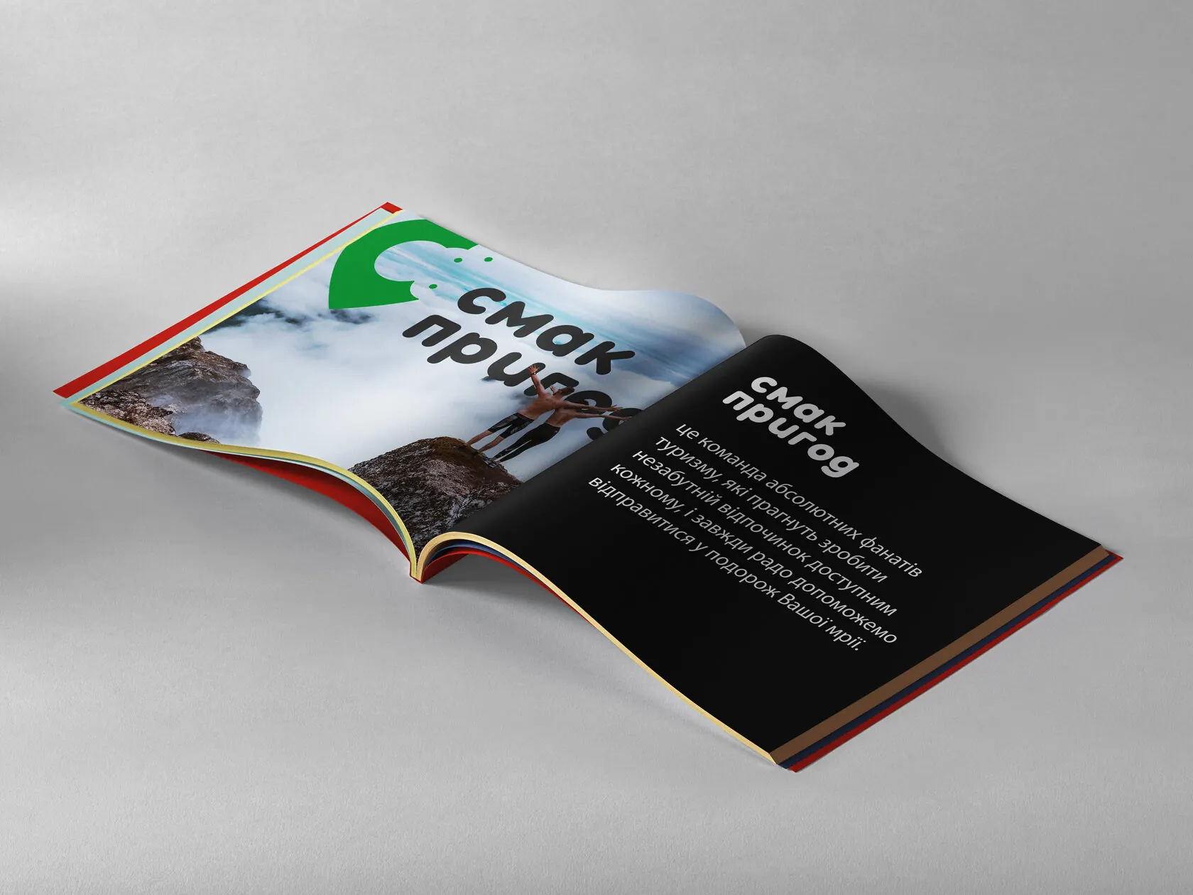
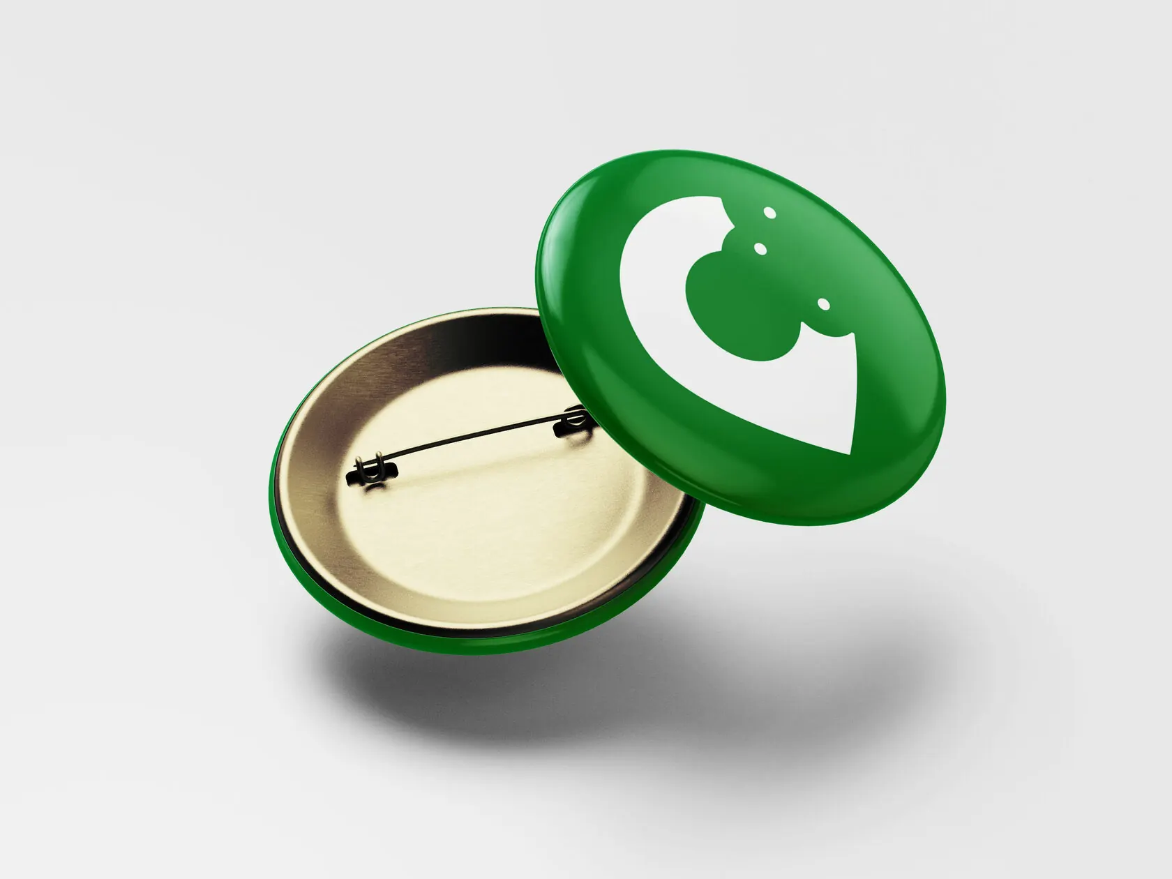
We built a “pin” mark from the first letter of the name: it's both a map marker and a symbol of the destination. A rich green became the main colour, and graphic “impression” blobs added movement to the identity. The system was rolled out to vehicles, outdoor advertising, print materials and merch for travellers.
A brand that works on the road
Vehicles are the most visible medium for a travel company. We made the bus livery the brand's main billboard, and kept the mark simple enough to be cut from vinyl, embroidered or printed on a badge.
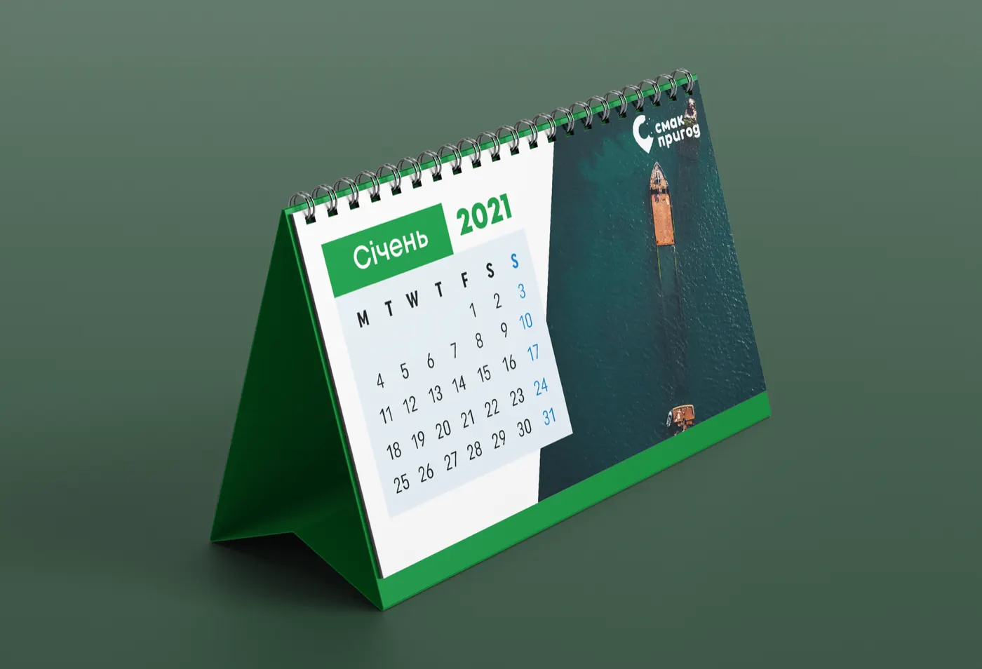
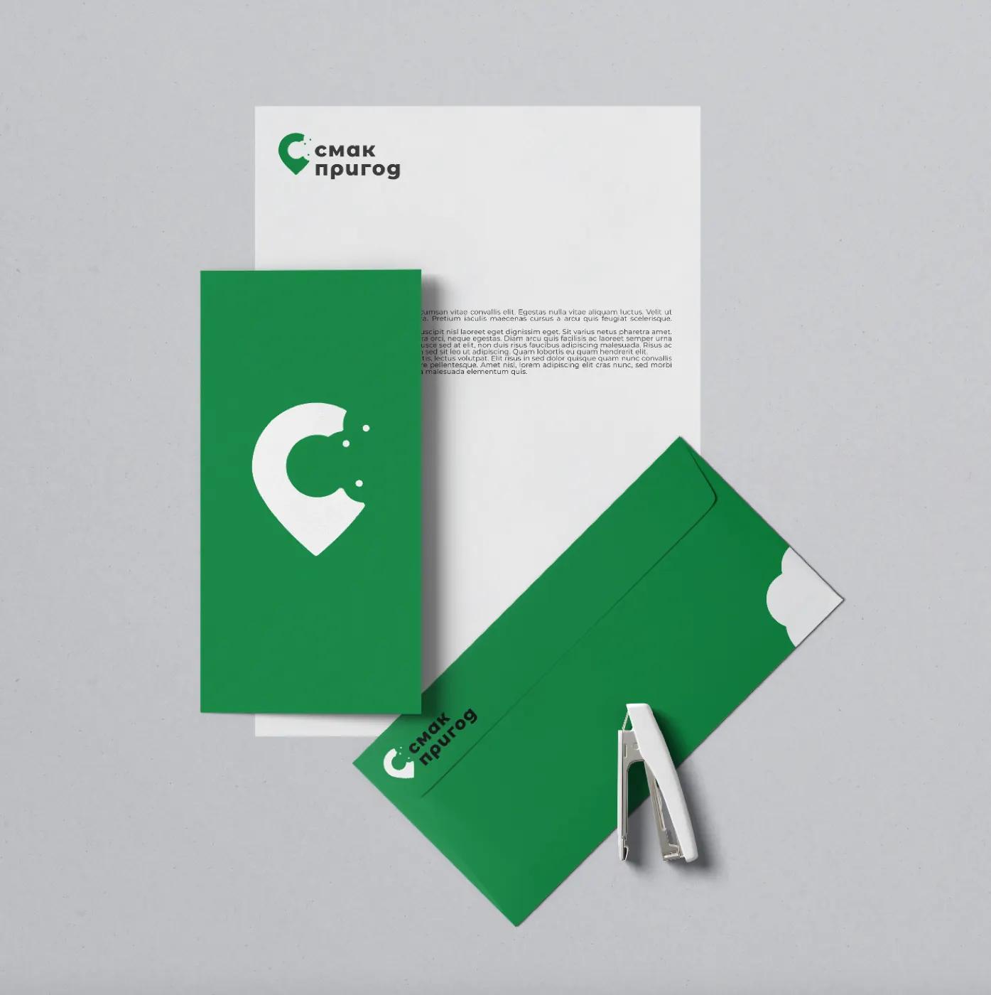
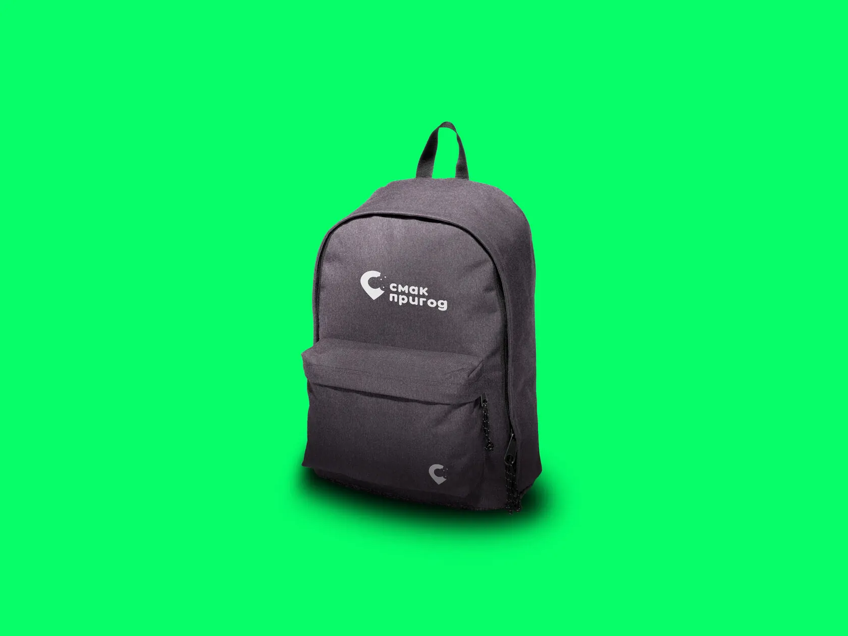

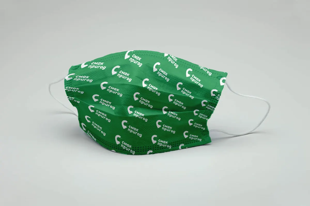
A journey starts the moment you see a bus with a familiar mark.
(Contact)
Want the same? Let's talk.
Request sent
Thank you! We will get back to you within a day.