Liniya Budivnytstva — Rebranding of a construction company
Rebranding of a construction company
A construction company that looks as solid as its buildings: black, gold and clean geometry.
(Challenge)
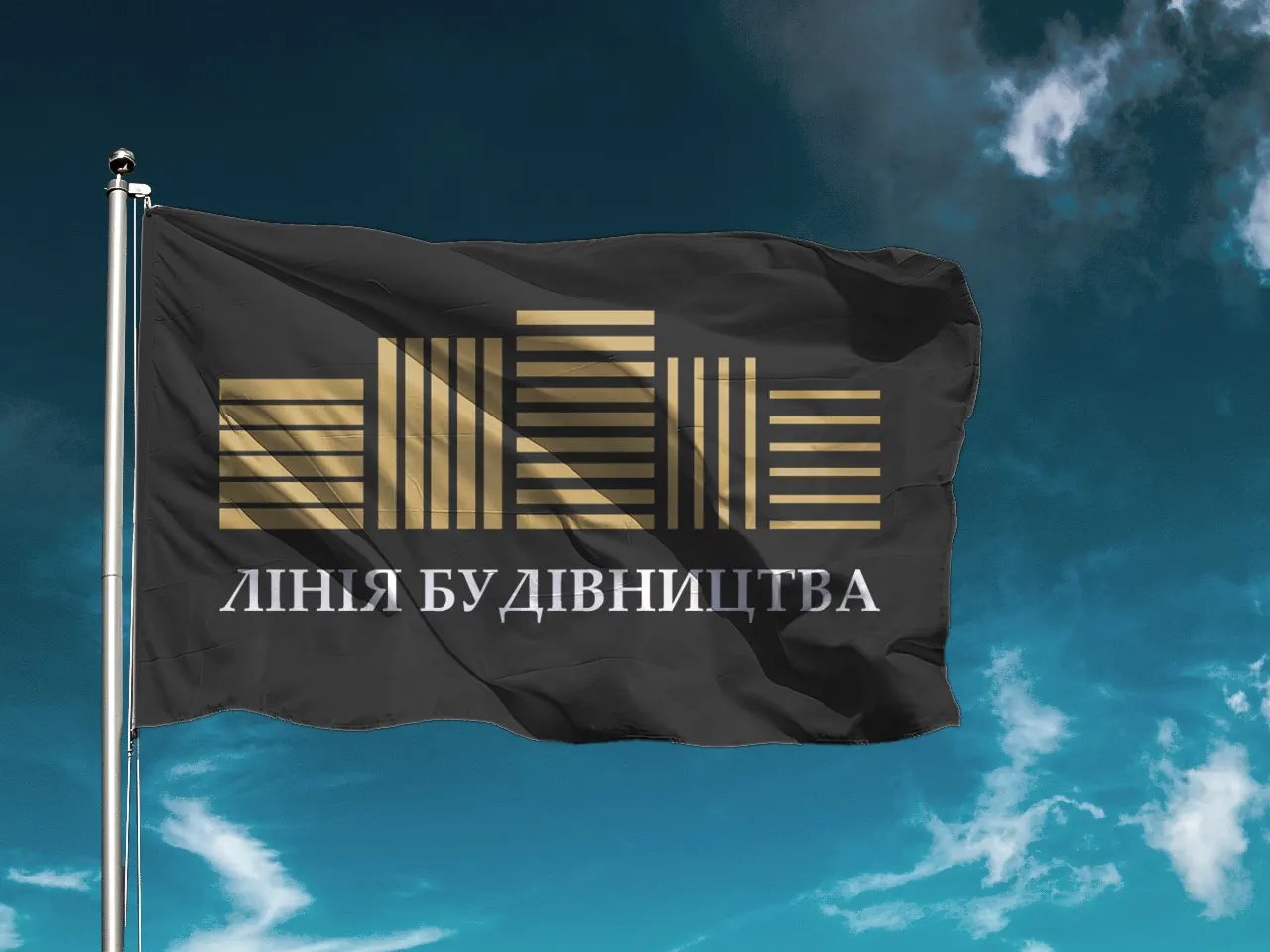
Liniya Budivnytstva (“Construction Line”) needed an image that matches the level of its projects: solid for investors and clients, clear for home buyers and practical for everyday use on the building site.
(Solution)
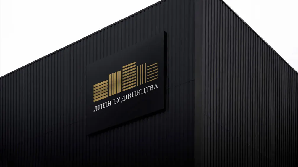
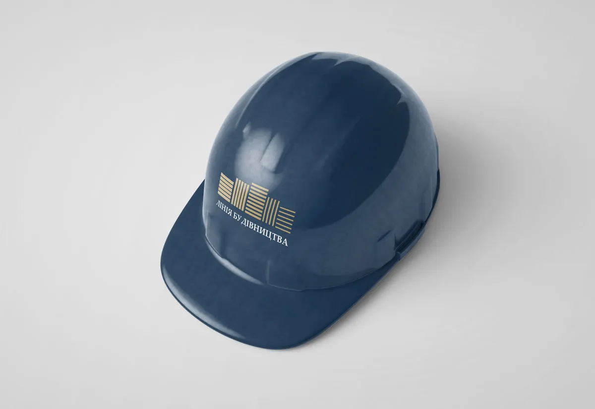
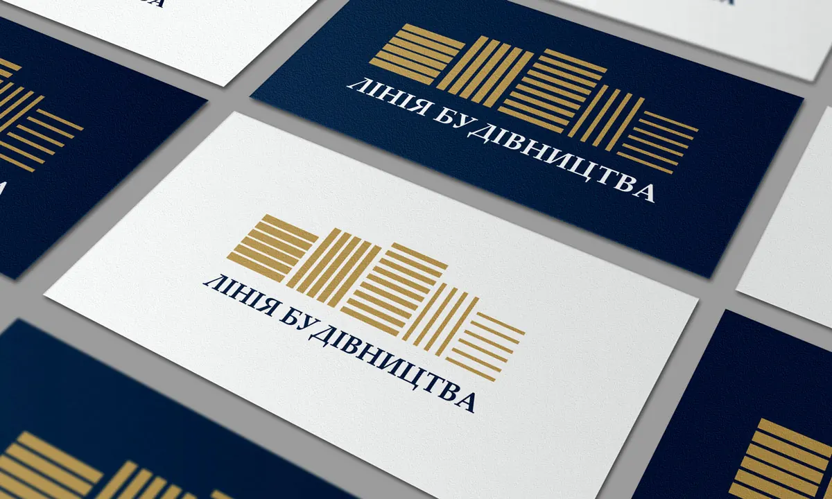
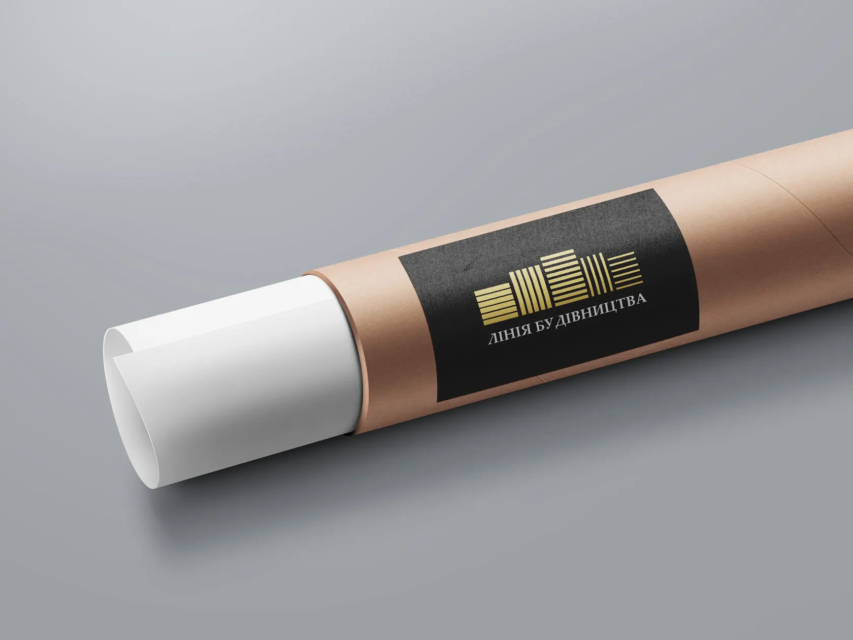
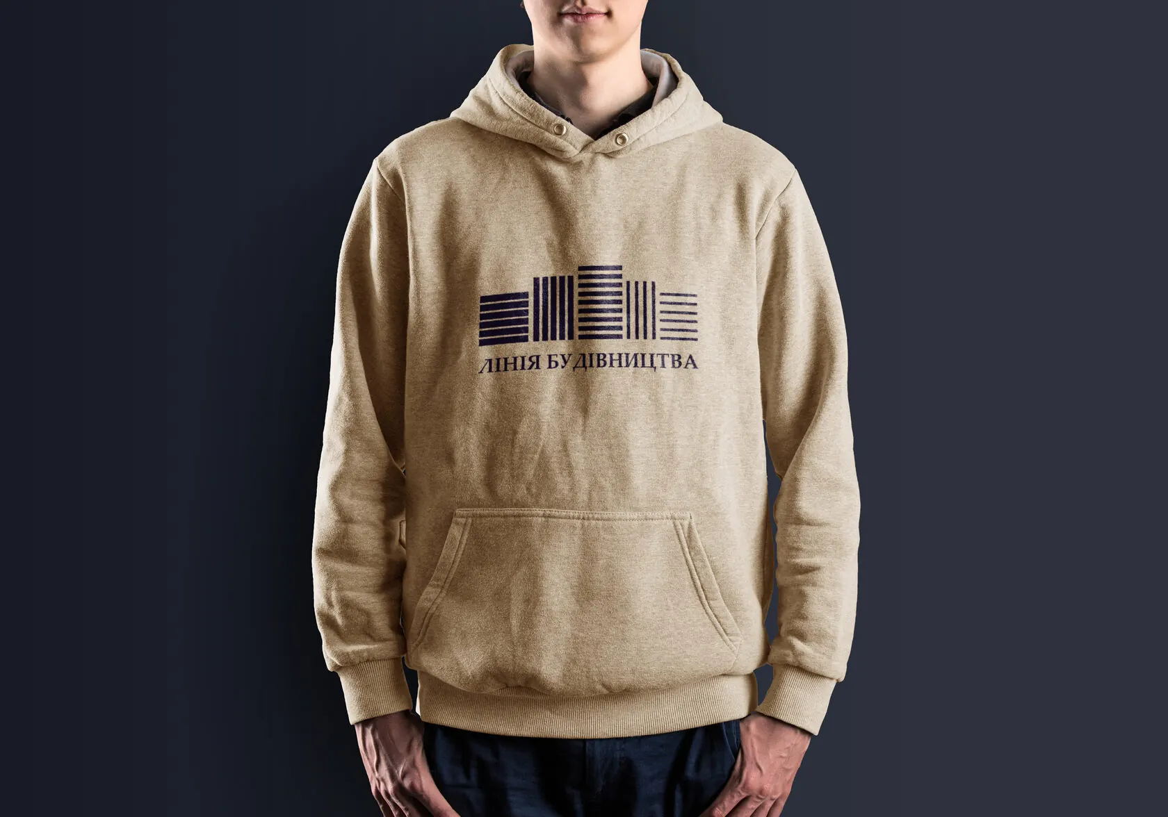
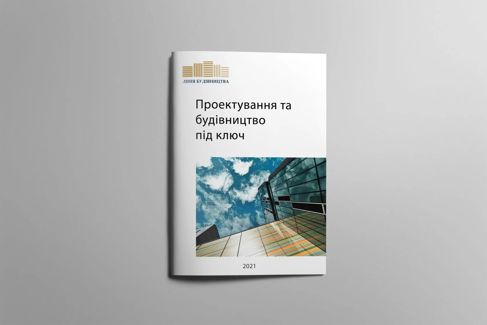
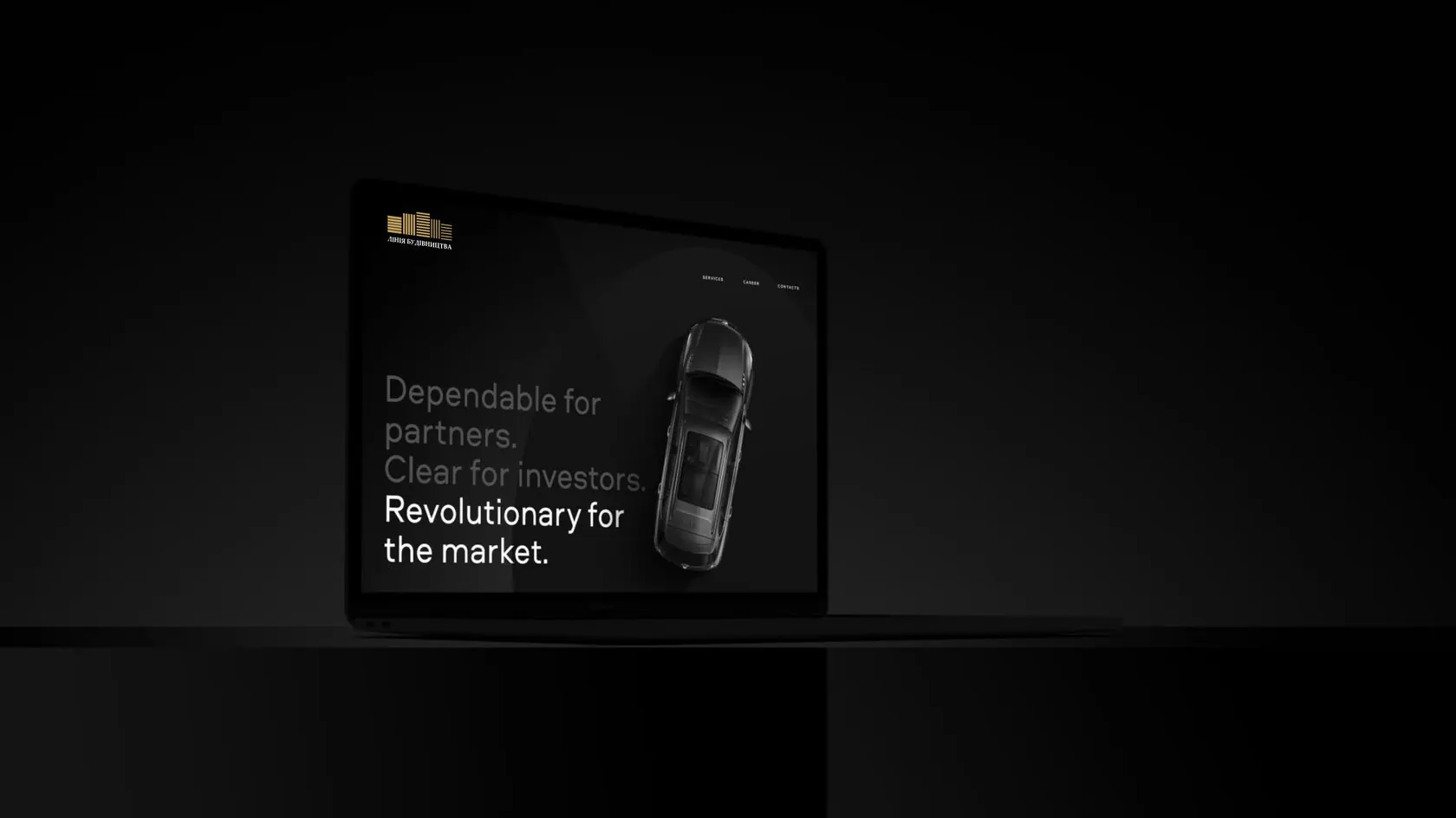
The mark is built from vertical lines of different heights. They read both as a city skyline and as a growth chart. The black-and-gold palette adds status, and the simple geometry lets the mark go on anything: from a façade plaque and a flag to a hard hat, a hoodie and a client brochure.
Status without excess
We deliberately limited the palette to two colours and the graphics to lines. That way the brand looks premium in print and doesn't fall apart on dirty machinery or construction fencing.

The lines a city is made of. And a brand people trust to build.
(Contact)
Want the same? Let's talk.
Request sent
Thank you! We will get back to you within a day.