SOIT — Rebranding of a transport company
Rebranding of a transport company
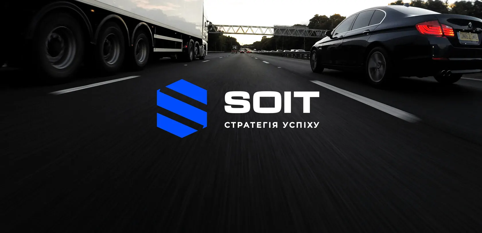
A dynamic blue brand for a carrier, visible on the motorway from hundreds of metres away.
(Challenge)
Refresh a logistics company's identity: make it more modern, more visible on vehicles and consistent across documents and partner communications.
(Solution)
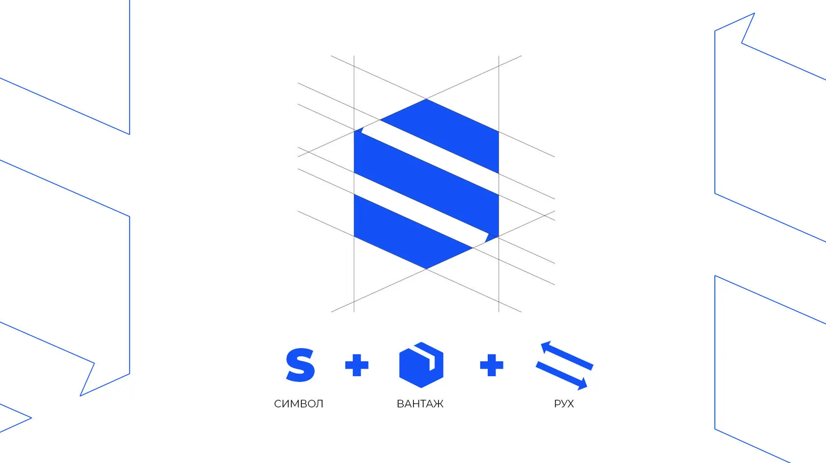
The mark is built on a modular grid of diagonal elements that form the letter S and convey movement. The same diagonals became the truck graphics — large white planes on blue are visible from afar in any weather. The system was carried over to business cards, letterheads and corporate materials.
Mark construction
The logo consists of several identical modules. This keeps it stable at any size and provides a ready-made graphic language for all media — no extra illustrations needed.
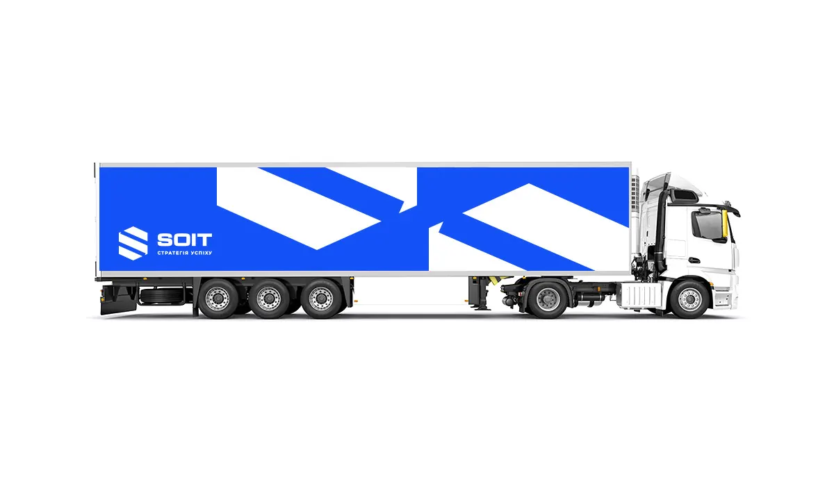
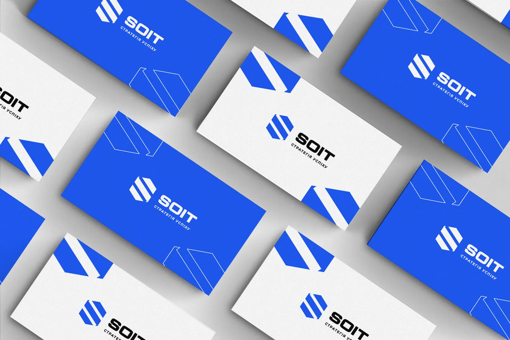
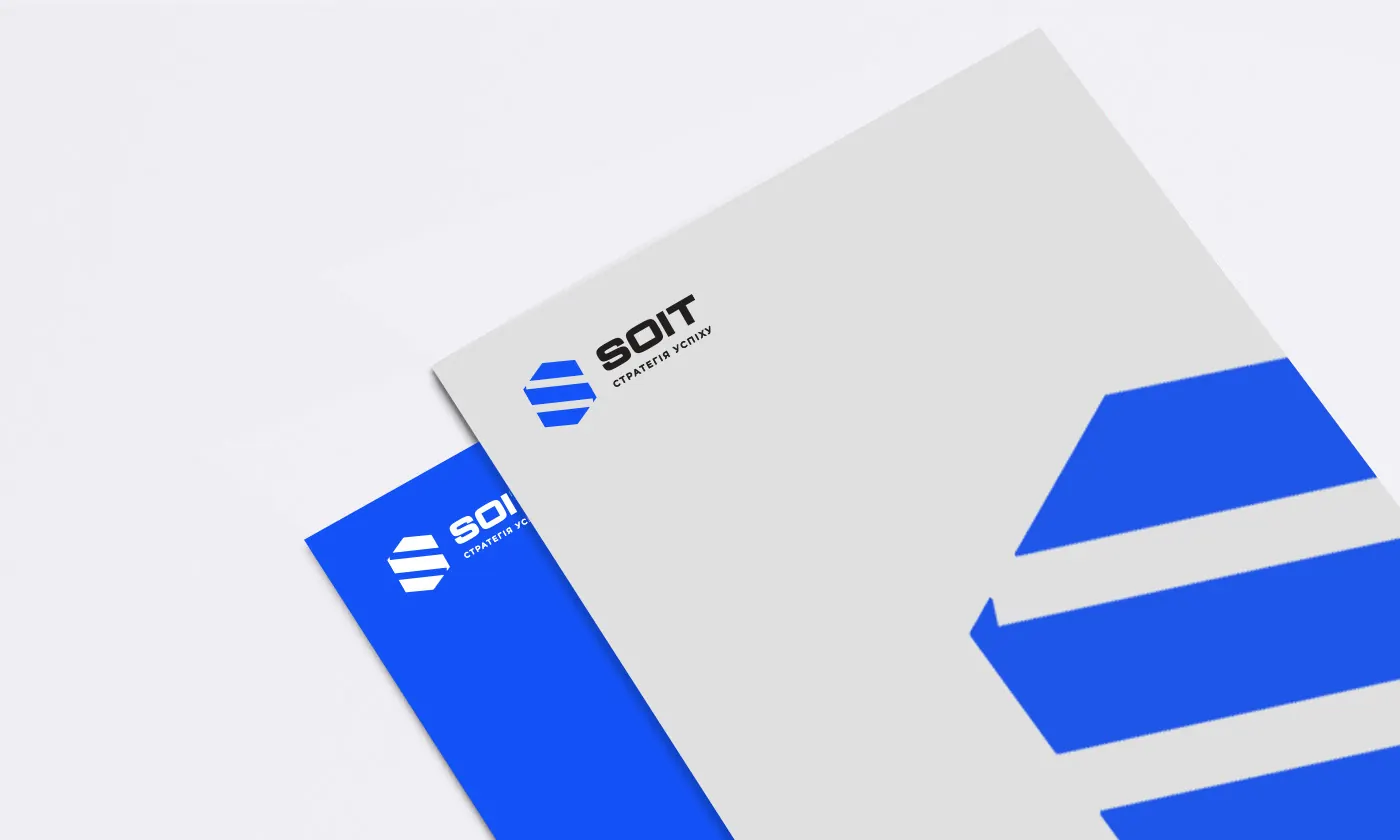
A diagonal is the shortest path. That's exactly how we built the mark.
(Contact)
Want the same? Let's talk.
Request sent
Thank you! We will get back to you within a day.