Elektroservis — Logo and website for an electrical engineering company
Logo and website for an electrical engineering company
A modern electrical engineering company — and a brand that shows it: a new logo and corporate website for a manufacturer of transformer substations and switchgear.
(Challenge)
Elektroservis designs, manufactures, installs and commissions electrical systems — from packaged transformer substations to 0.4–110 kV switchgear. With almost 30 years of history, the company needed a mark that conveys technology and reliability, and a website that clearly explains complex products to clients, engineers and partners.
(Solution)
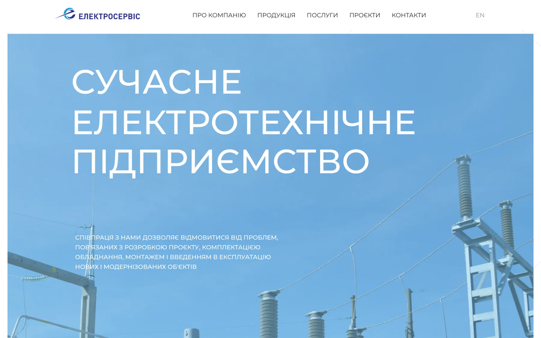
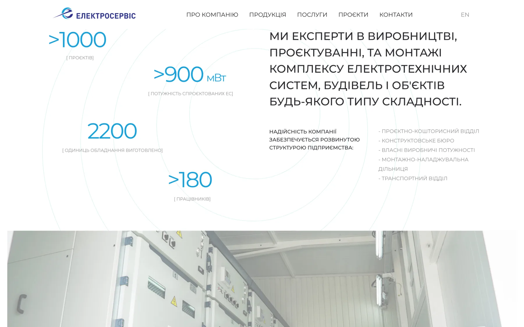
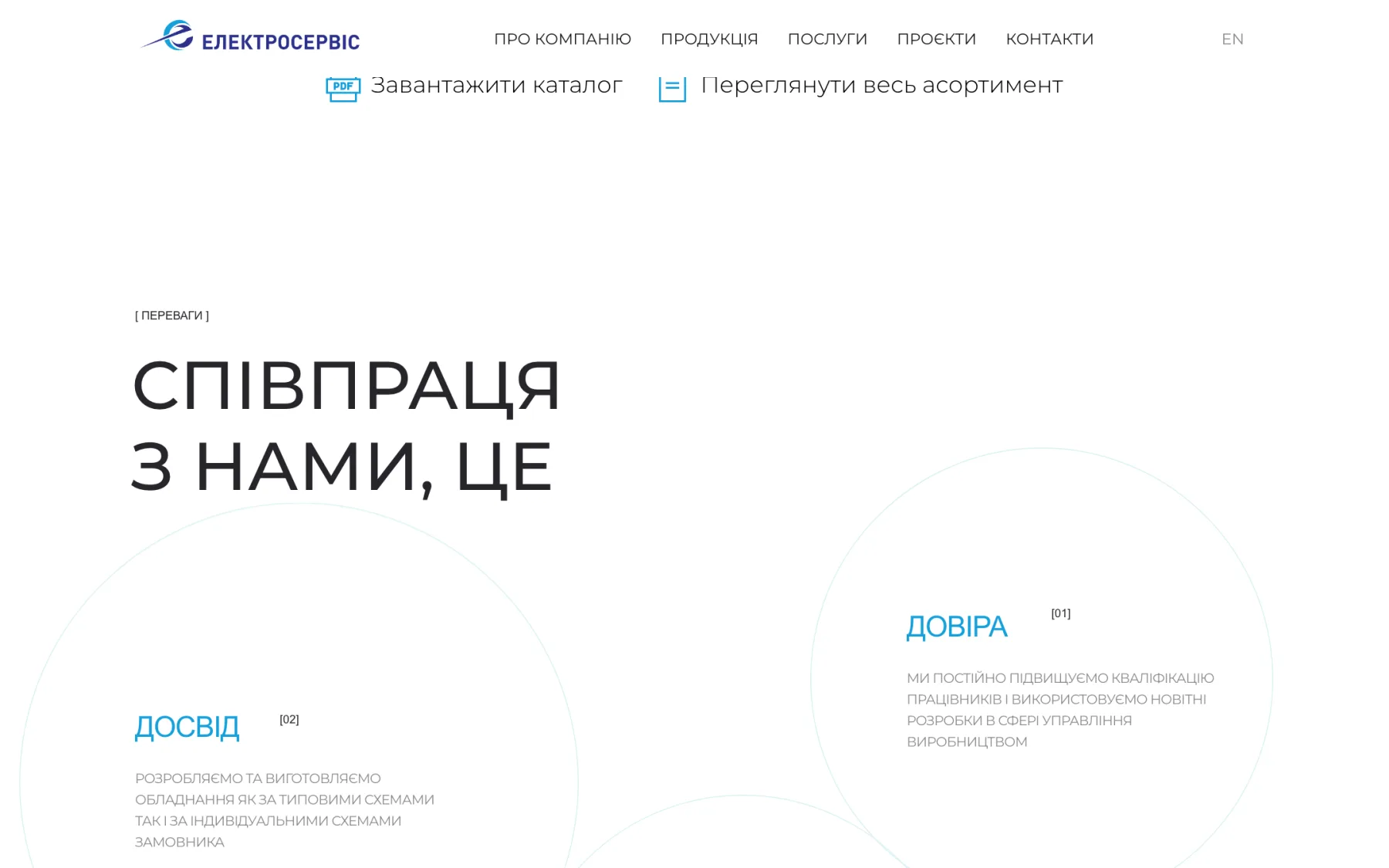
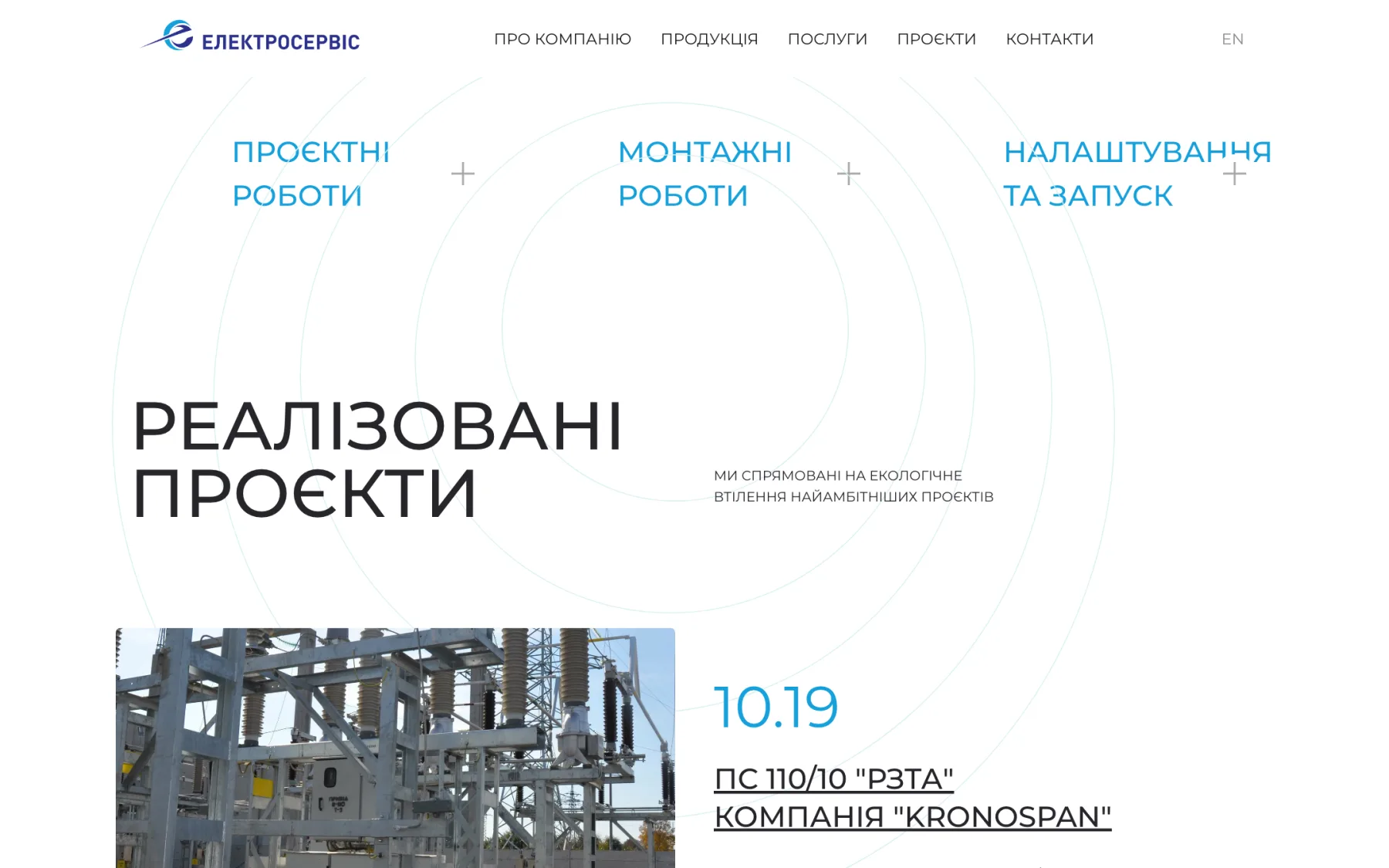
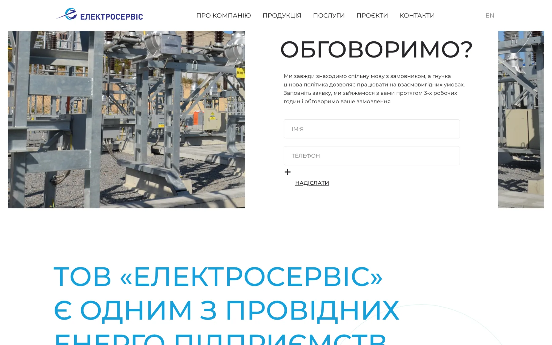
We created a logo where the letter “e” closes into a circle, with a dynamic impulse arrow passing through it — an image of energy and flowing current. The blue and cyan palette continues the associations with electricity and industry. The website is built as a corporate showcase: key company figures, a product catalogue, advantages, services — design, installation and commissioning — and completed projects. The enquiry form and contacts with a map are always at hand.

The mark
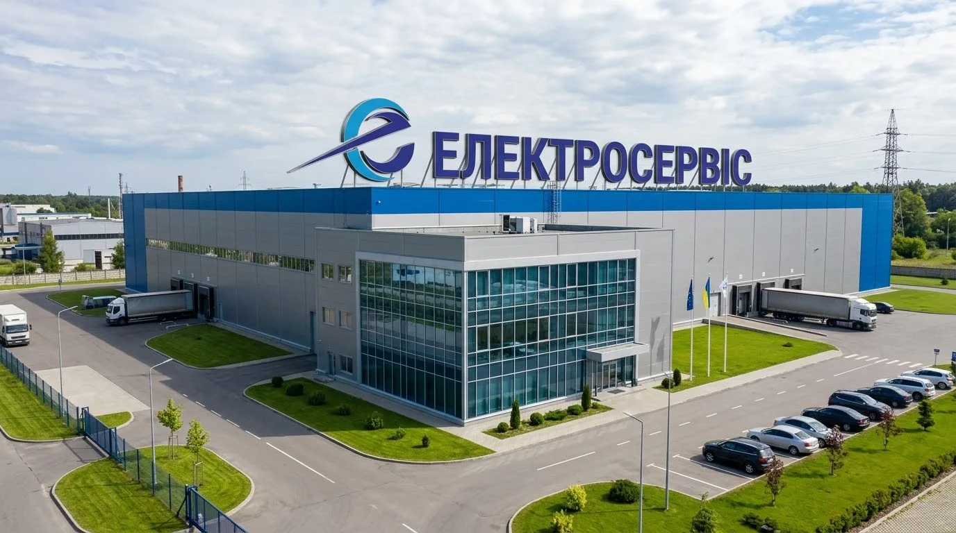
The letter “e” closed into a circle and an impulse arrow piercing it — energy in motion. The mark reads well on the factory façade, on an equipment nameplate and as the website favicon.
Complex products, made clear
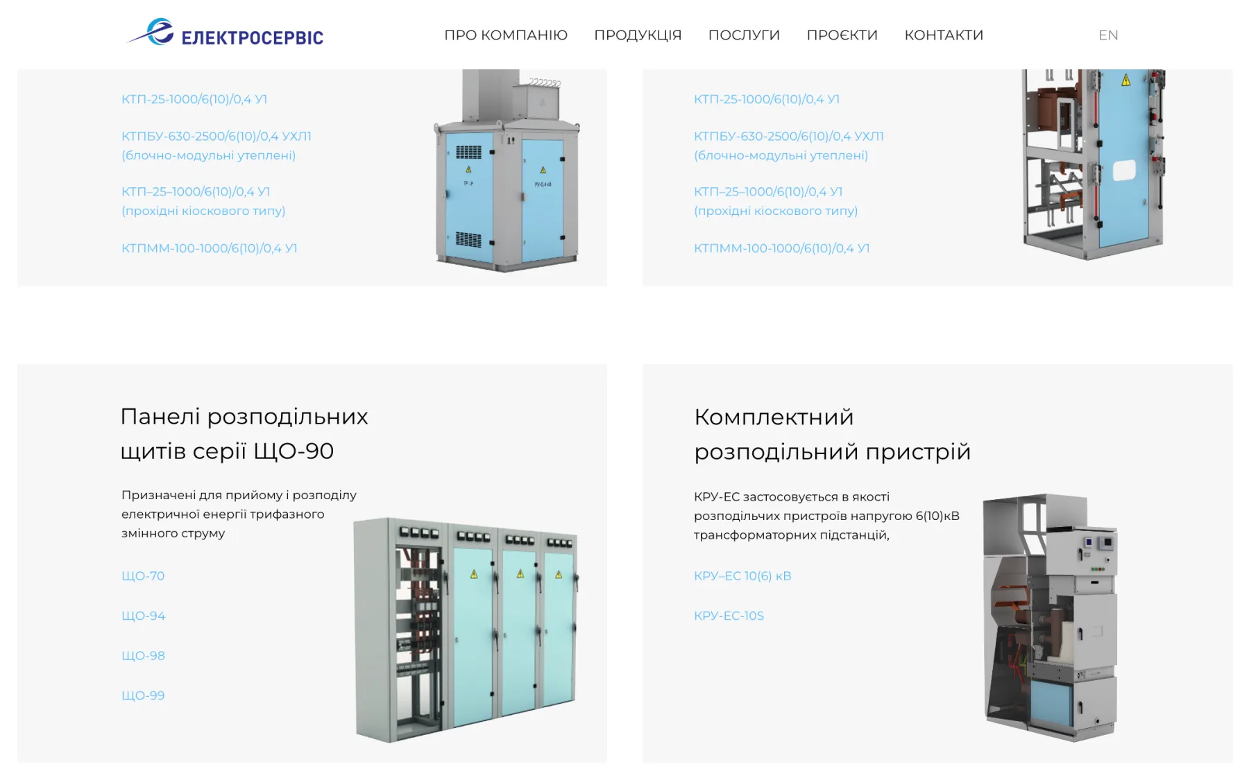
Packaged substations, KSO cells, ShchO-90 switchboard panels, switchgear — technical products bought by engineers. So the catalogue relies on short descriptions and specifications, and the full PDF catalogue is one click away.
Engineering precision in every detail — from the substation to the logo.
(Contact)
Want the same? Let's talk.
Request sent
Thank you! We will get back to you within a day.