Dobryi Tur — New mark and visual identity for a travel agency
New mark and visual identity for a travel agency
A travel agency that opens up the Carpathians through real routes. We created the mark and built a whole system around it — colour, type, pattern, illustration and brand media, from an avatar to a coach. The name means “Good Trip”.
(Challenge)
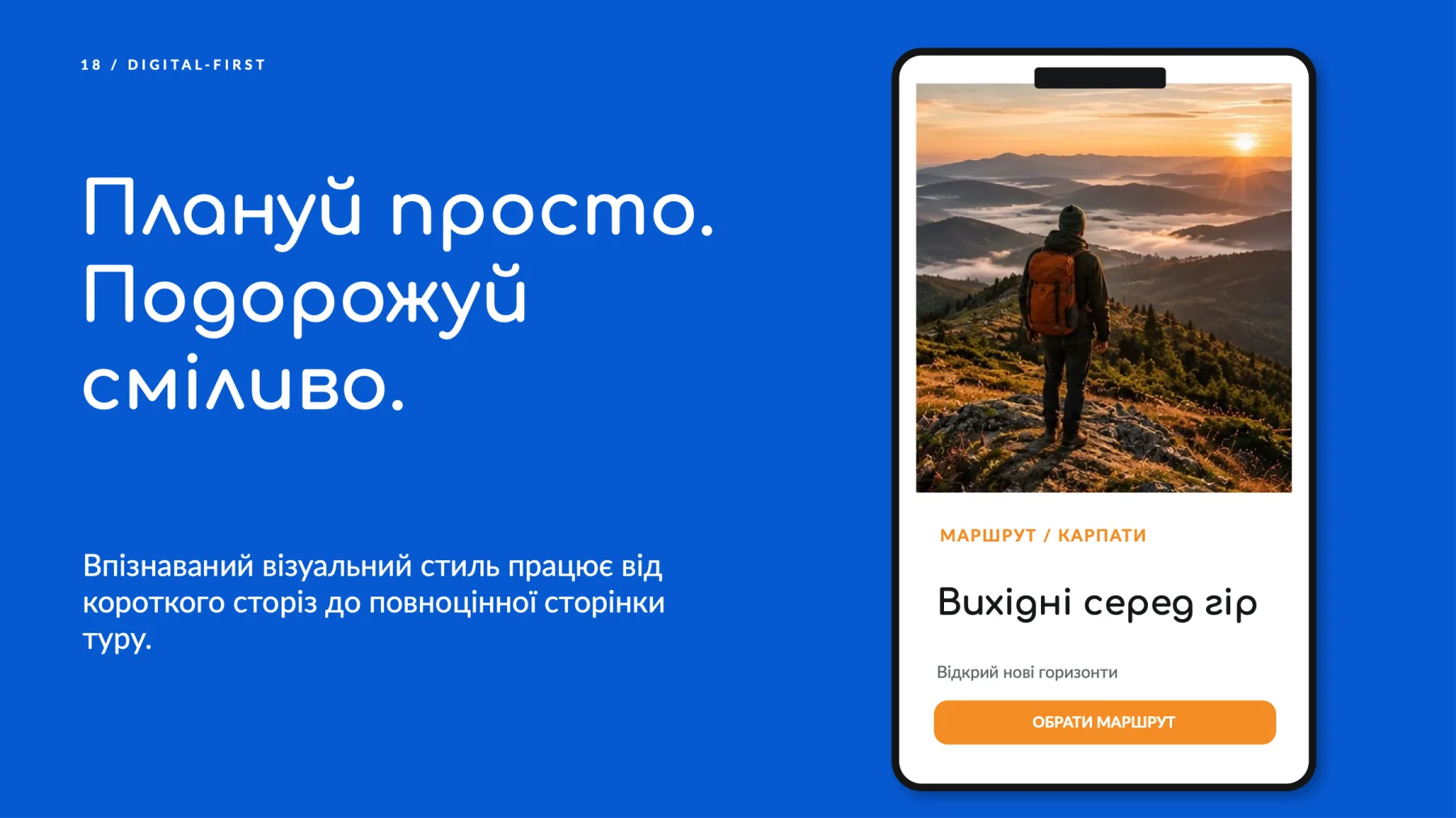
Dobryi Tur takes travellers to the Ukrainian Carpathians. The brand needed a modern visual language that conveys the energy of movement, warm communication and the urge to hit the road — and works equally well as a tiny social media icon and on the side of a coach.
(Solution)
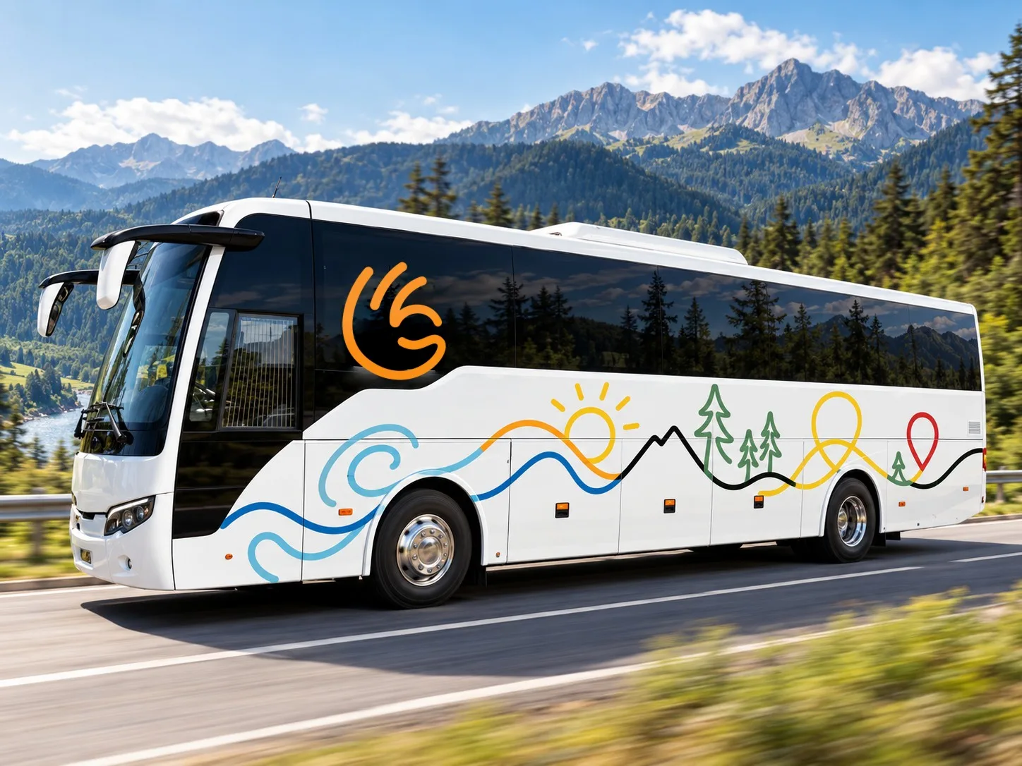
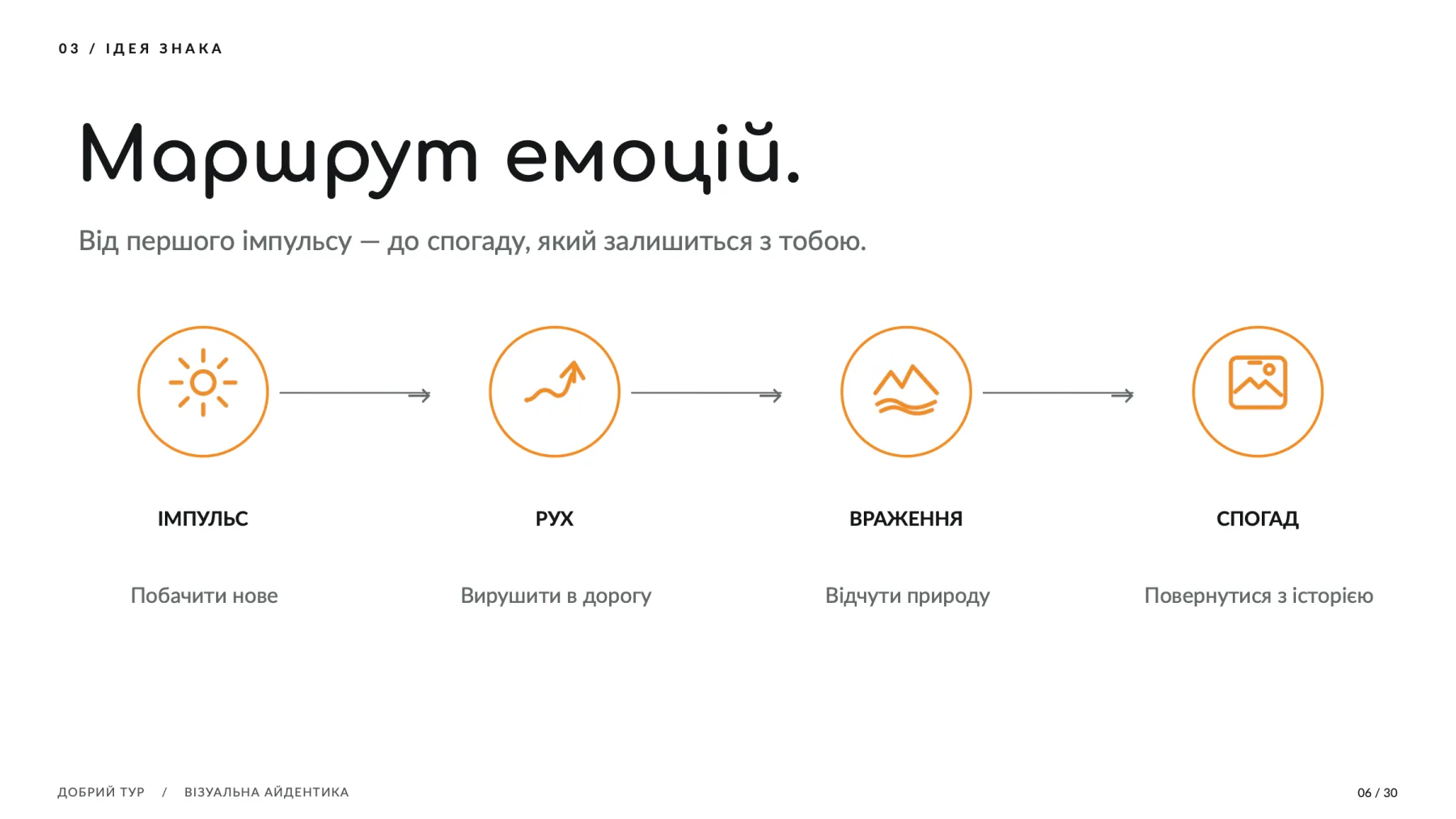
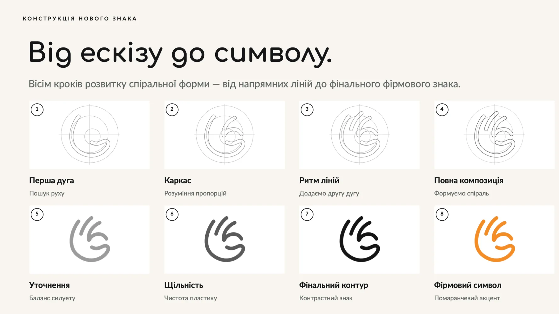
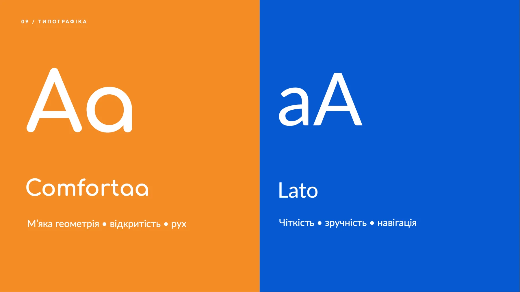
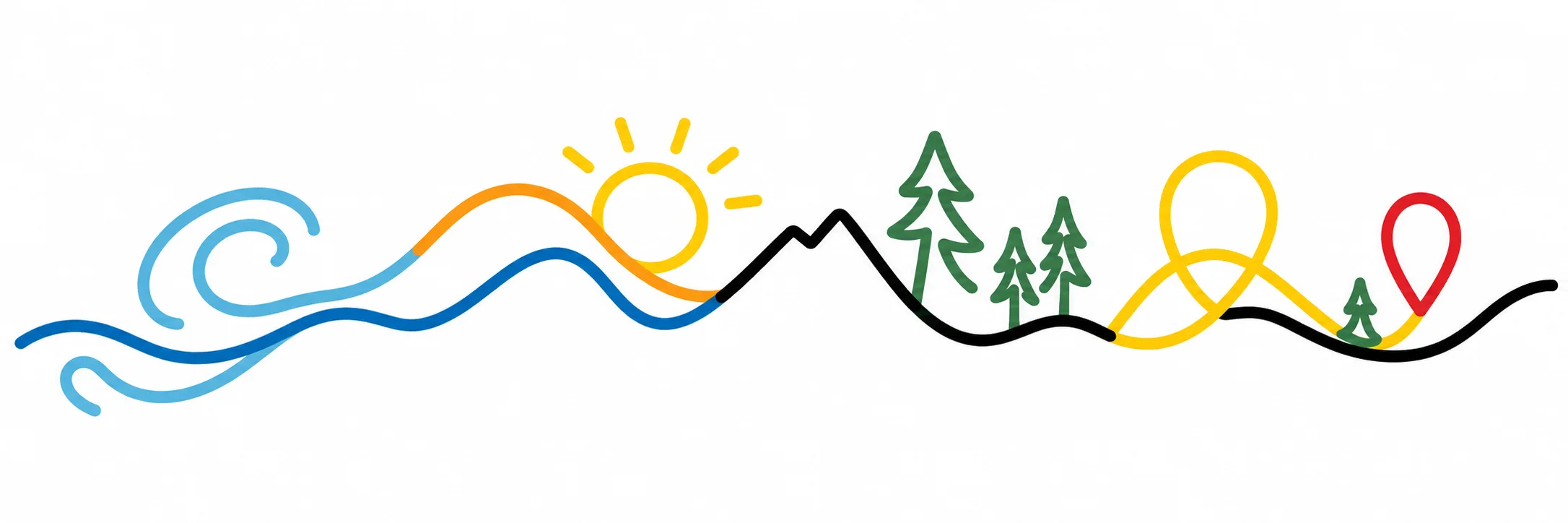
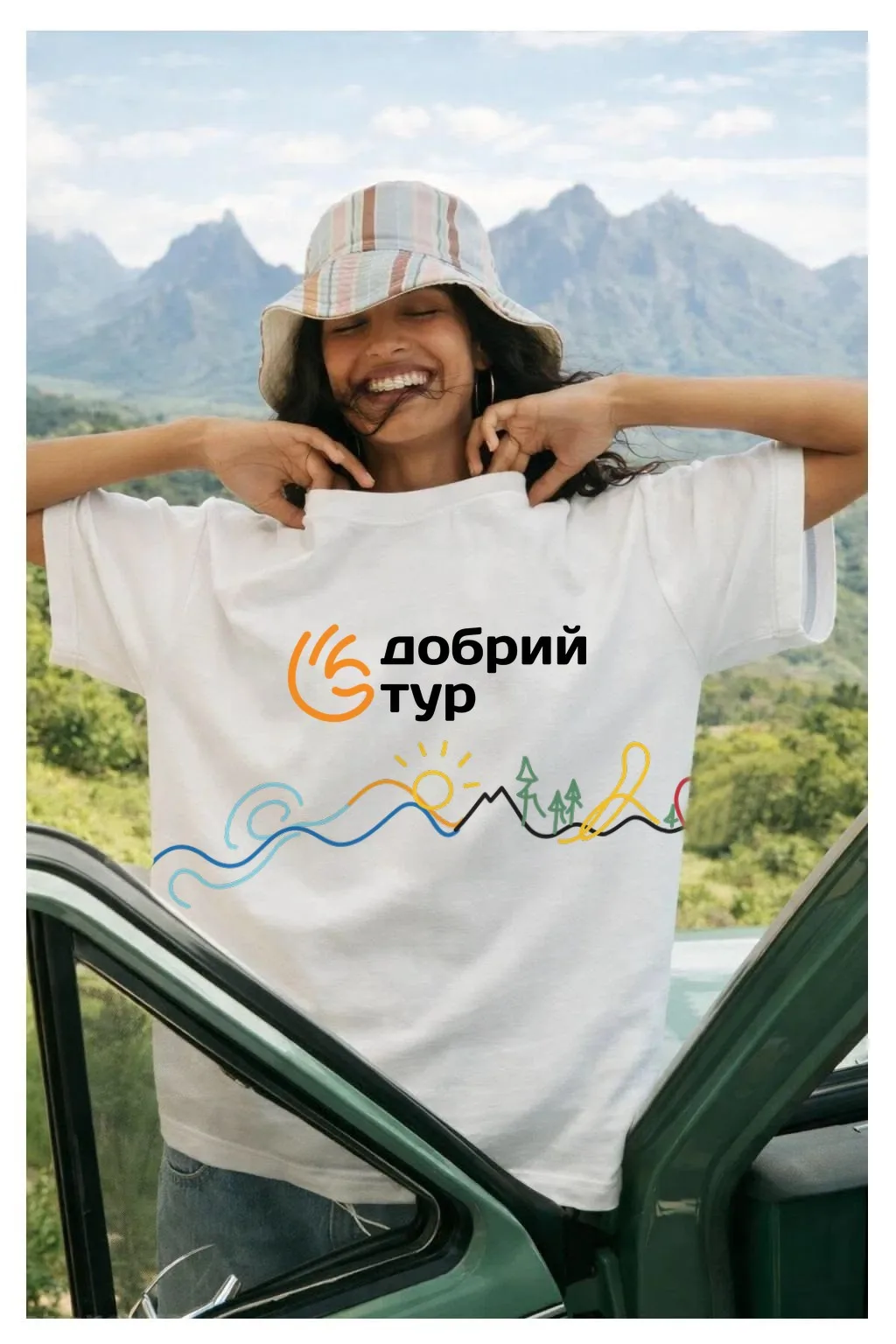
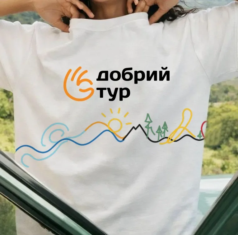
We built the mark as a “route of emotions”: open, energetic arcs curl into a spiral — from the first impulse to see something new to the memory you bring home. The form was refined in eight steps, from guide lines to a clean symbol. The orange “Sun” became the core of the palette, while blue, sky, yellow and a deep dark tone add character. Comfortaa gives the brand softness and openness; Lato keeps copy and navigation clear. The mark's line grew into a pattern and a signature illustration where waves, sun, mountains, forest and route form one continuous line.

A mark that leads forward
Open lines, energetic arcs and a recognisable silhouette. The smooth arcs read as direction and movement, and the bright orange recalls the warmth of the sun and the energy of new experiences. The mark became the hero of the whole system.
Colour and type
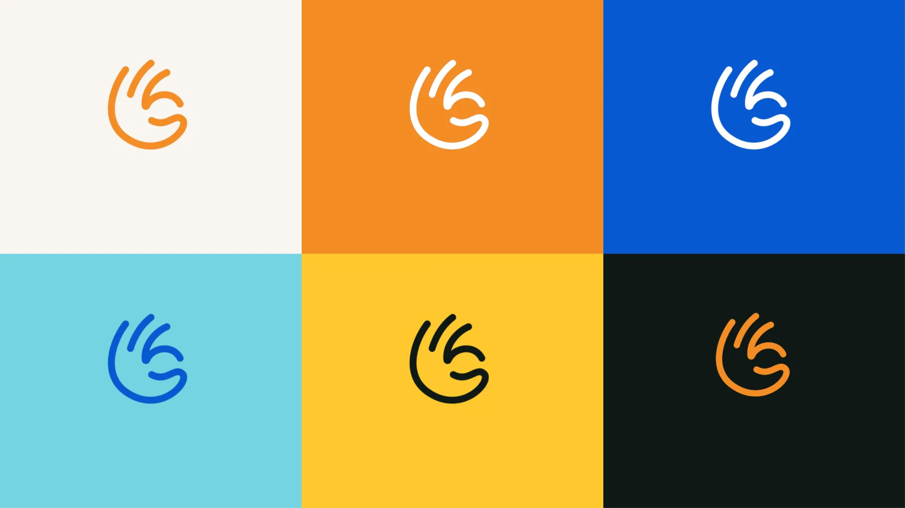
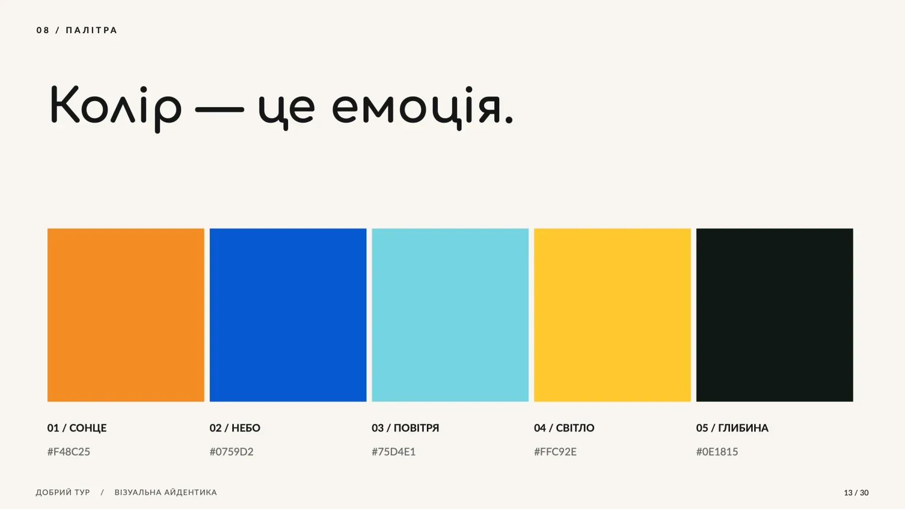
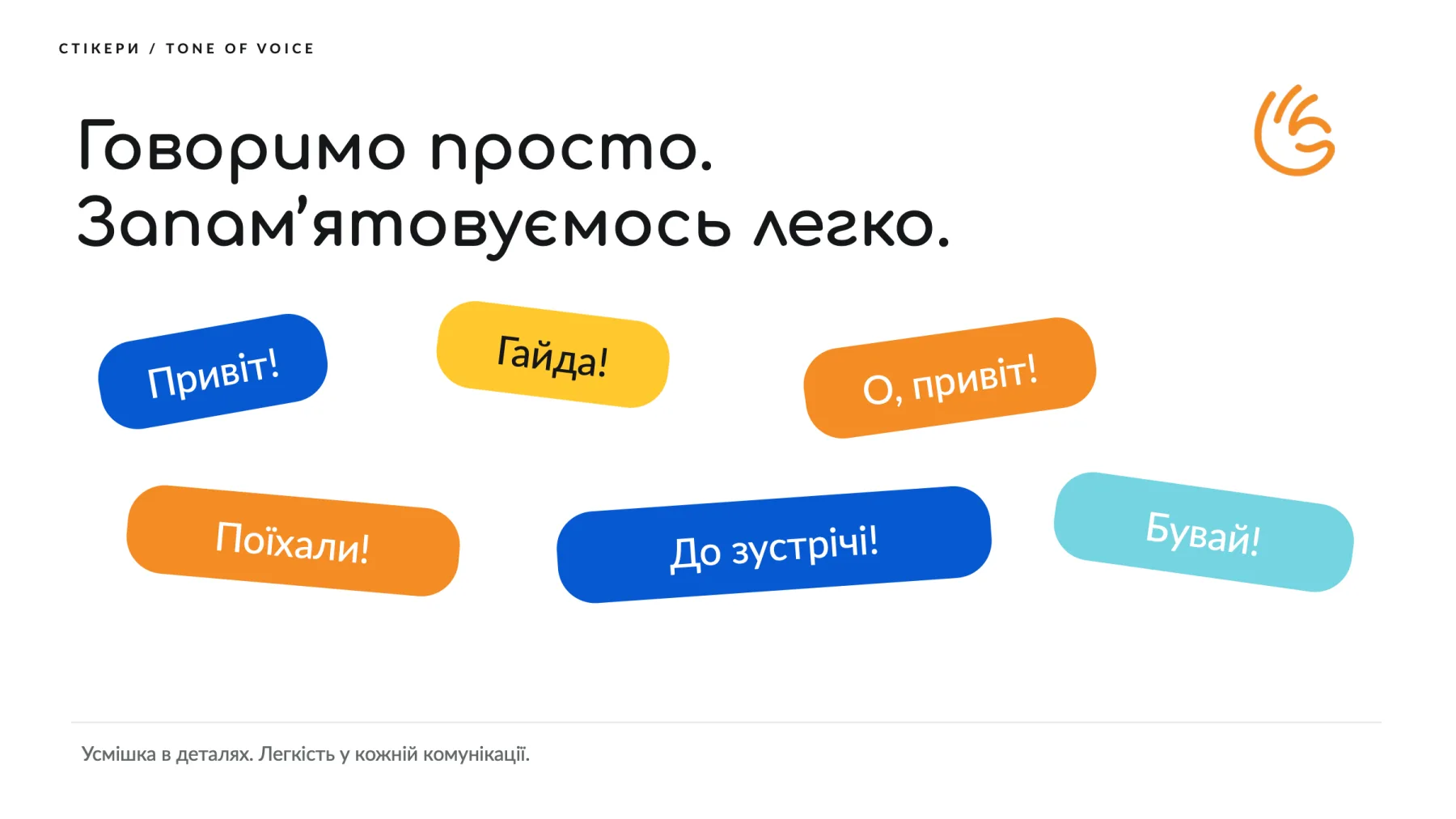
The palette is built around the warm orange “Sun” — the colour of sunshine and new experiences. “Sky”, “Air”, “Light” and “Depth” add energy and contrast to communication. Headlines are set in the rounded Comfortaa, echoing the arcs of the mark, while copy and navigation use the calm Lato.

A brand that travels with you
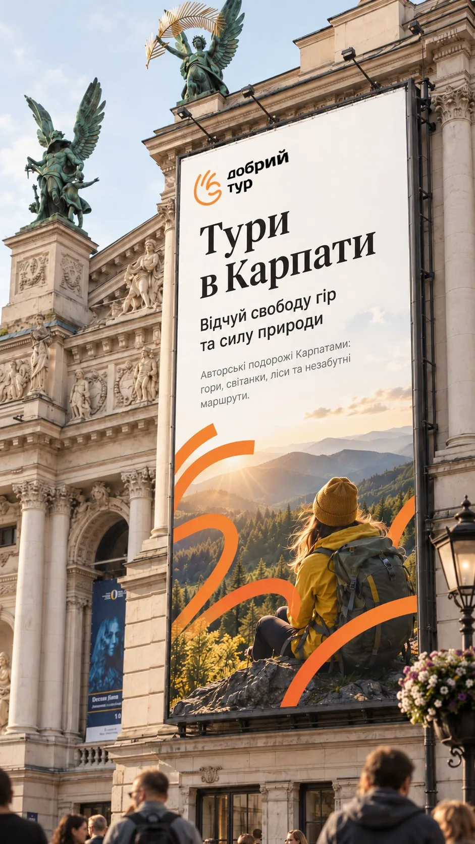
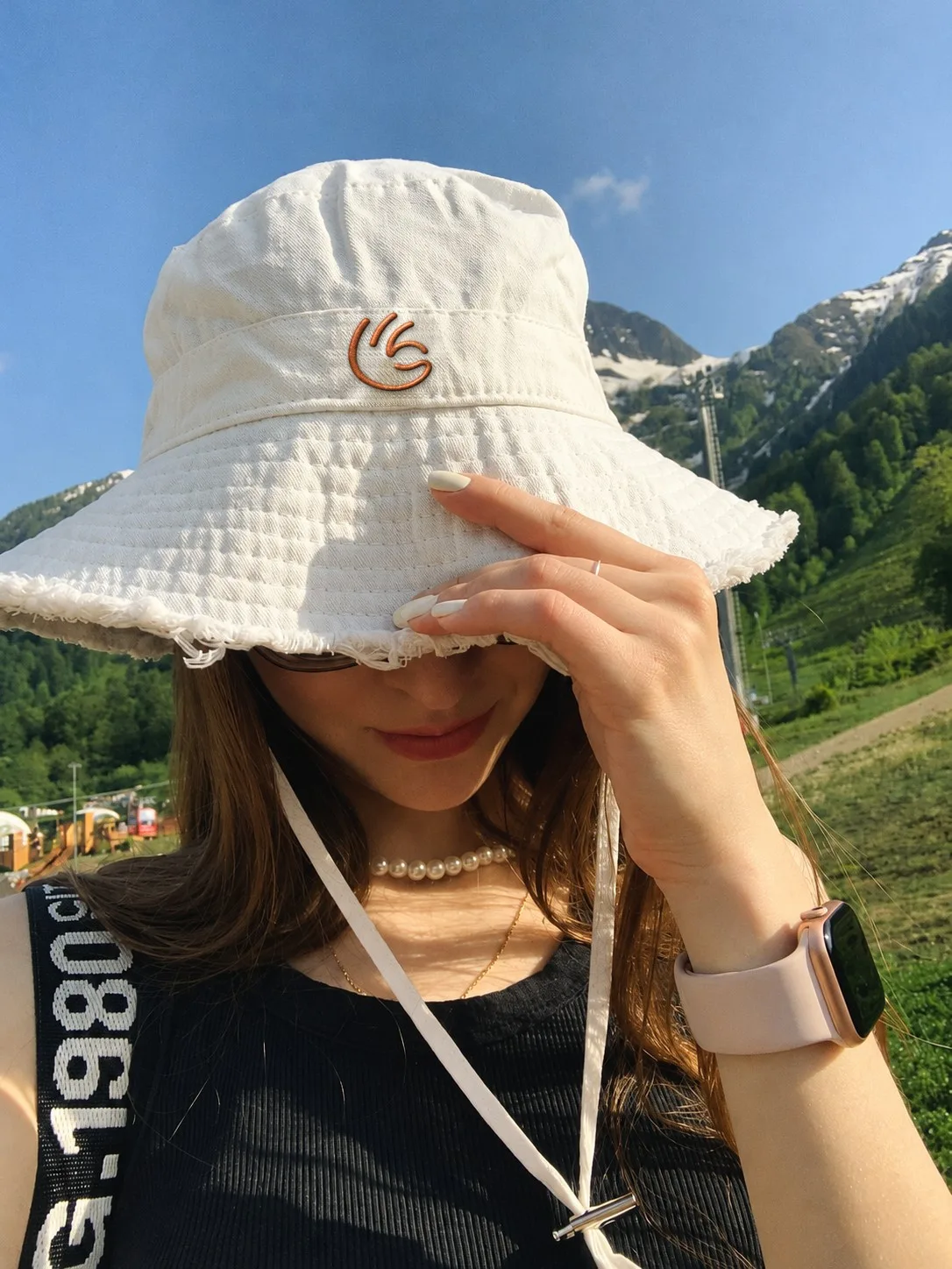
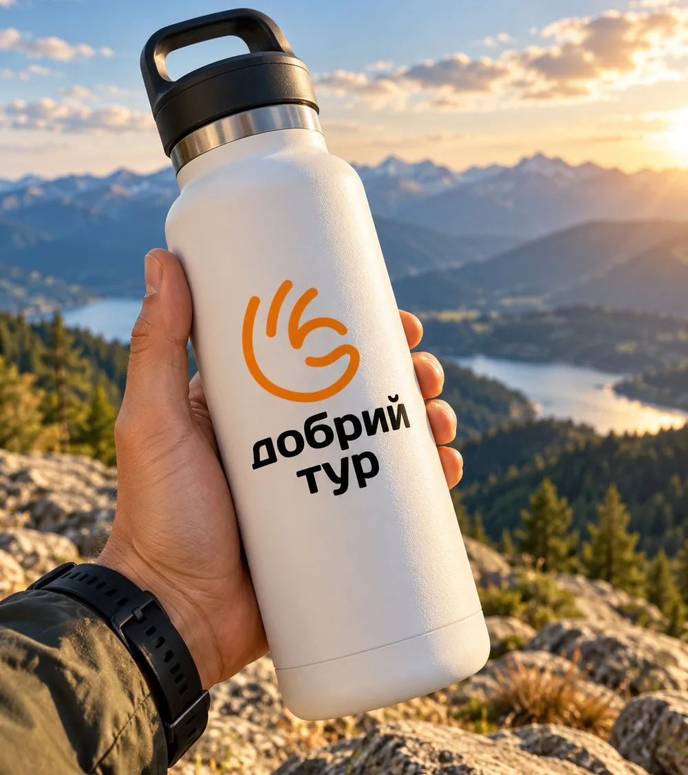
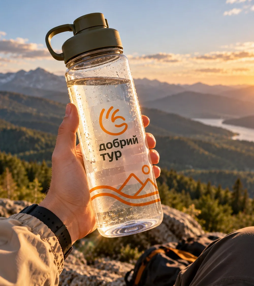
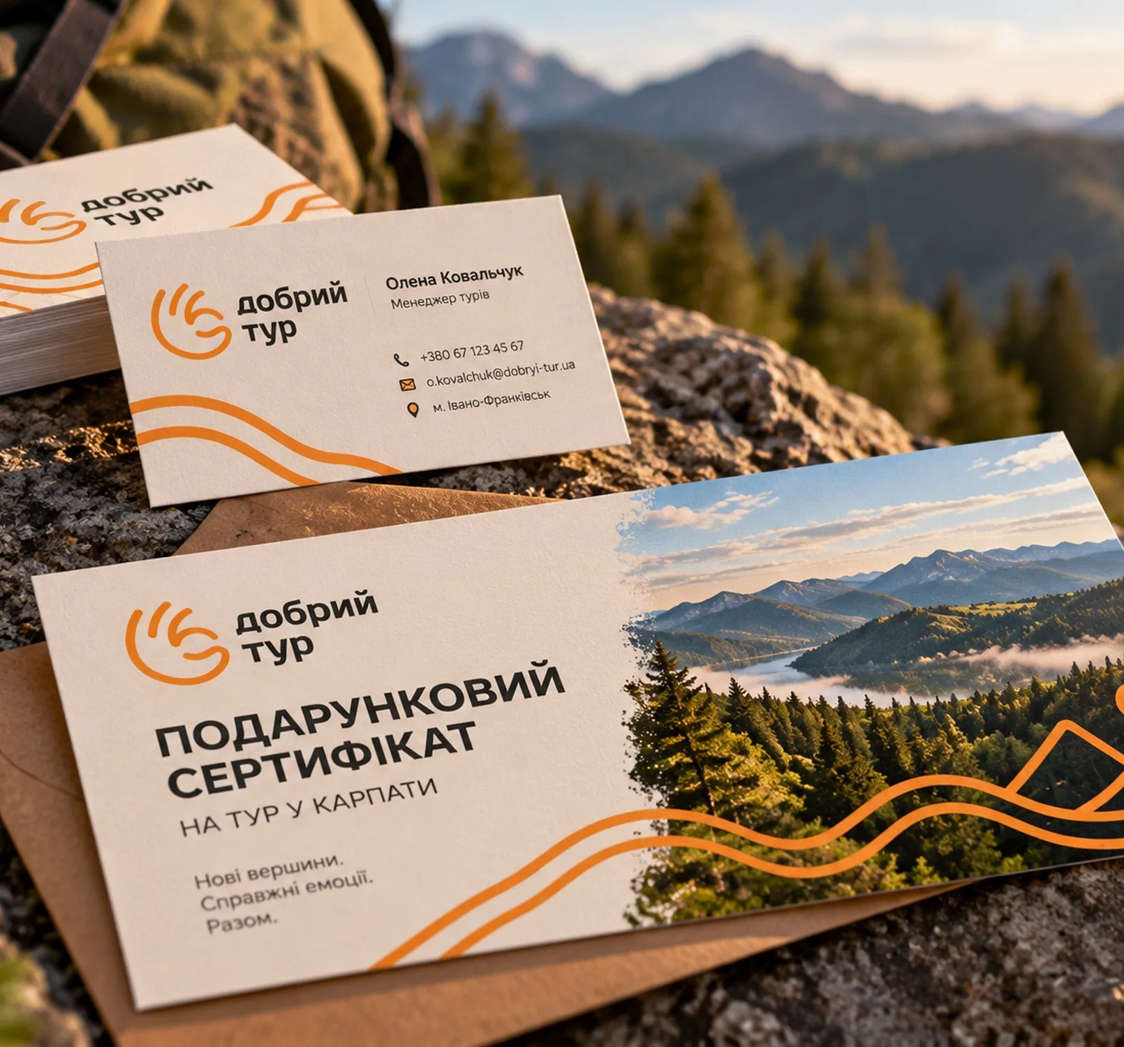
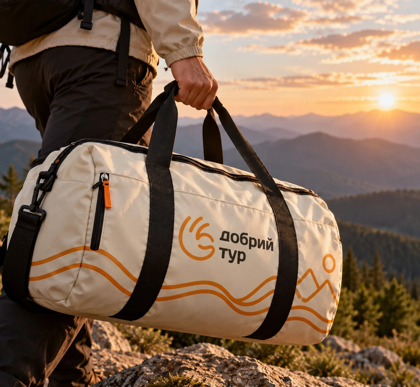
The mark, name and route lines work on large formats — from a city billboard to the side of a coach on a mountain road — and on the things travellers take with them: a bottle, a bag, a T-shirt and a bucket hat.
The road becomes a story. And the story becomes yours.
(Contact)
Want the same? Let's talk.
Request sent
Thank you! We will get back to you within a day.