Barolo.info — Logo for a digital platform about Barolo wines
Logo for a digital platform about Barolo wines
The crown of the “king of wines” and a bunch of perfect circles: a premium mark for an expert platform — free of wine clichés.
(Challenge)
Barolo.info is a professional digital platform about Barolo wines: expert ratings, full technical data for every wine, producers, crus, ageing, vintages and analytics. It is used by sommeliers, importers, retailers, collectors, critics and winemakers. The logo had to inspire trust as an authoritative source, look premium, convey the heritage of the Barolo region and still feel like a modern digital product. The main taboo was “the same old” grape with a leaf.
(Solution)
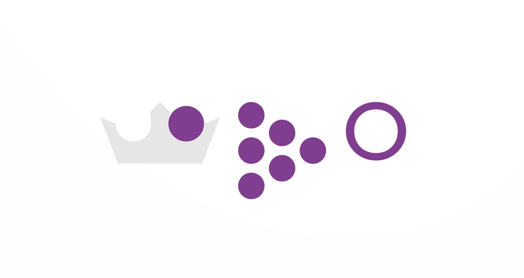
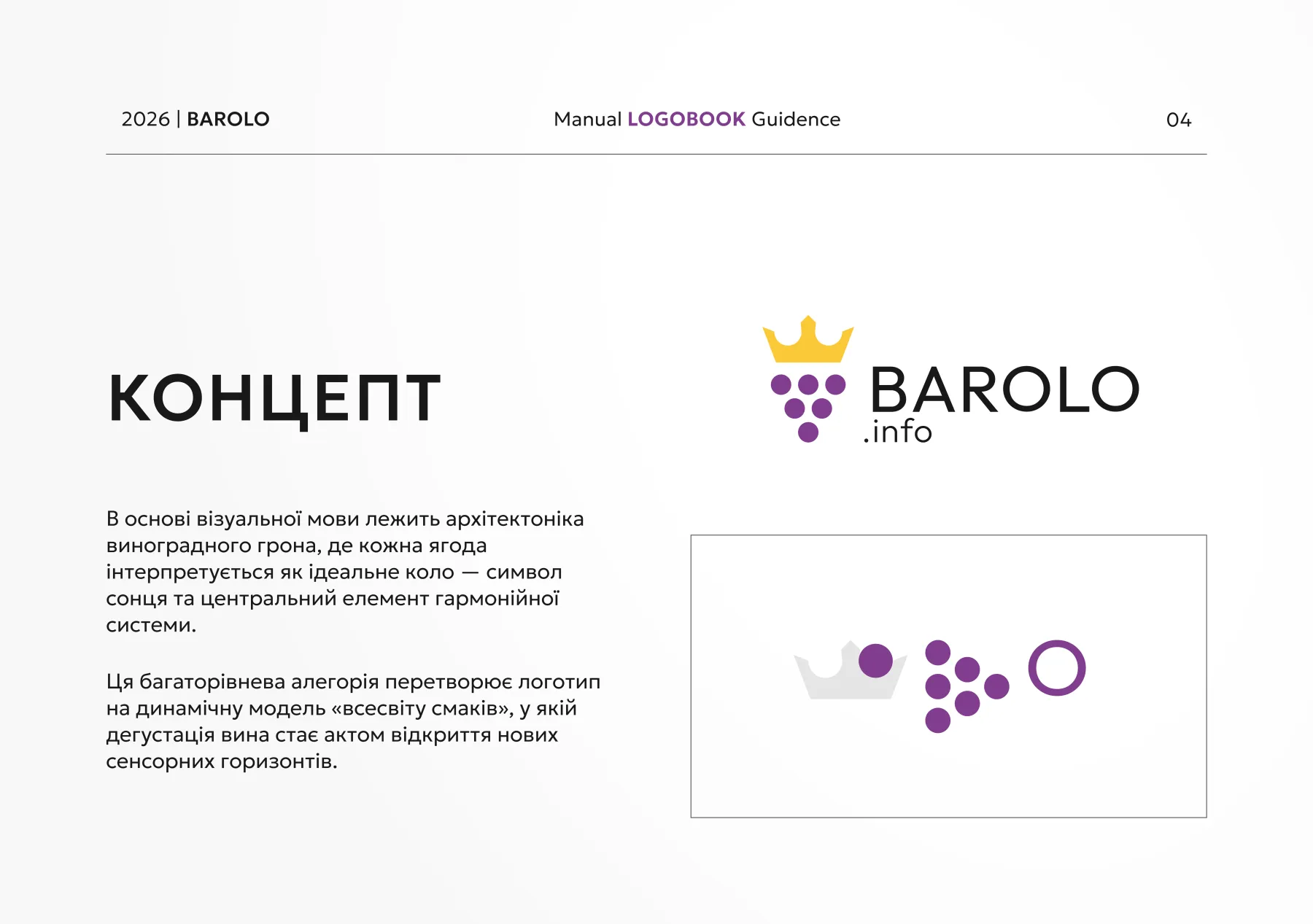
We started from the wine's own motto — Wine of Kings, King of Wines. The mark combines a crown and a bunch of grapes, and the bunch is built from perfect circles: each berry is a module of the whole system, a symbol of the sun and harmony. This turns the grape from a cliché into a geometric mark that works equally well as an app icon, on the website and on merch. The wordmark is a restrained grotesque BAROLO with a small .info, so the name reads easily at any size.
The brief
The client chose a combination or integrated logo — a mark together with the name, using allegory, abstraction and a touch of calligraphy. The character: refined and minimal, Latin script only. Touchpoints: the website and app, later social media and merch.
The bunch as a system
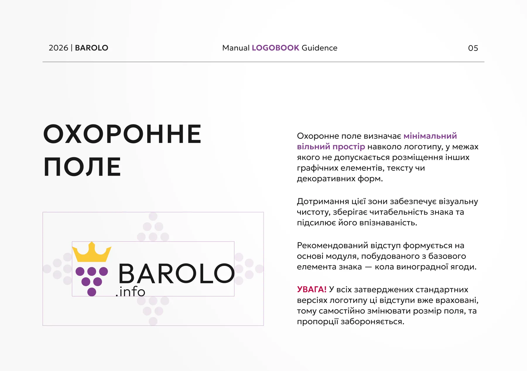
The visual language is built on the architecture of a grape bunch, where every berry is a perfect circle. The logo's clear space is built from the same circle, so the whole system rests on one module and scales without losing its proportions.
Colour
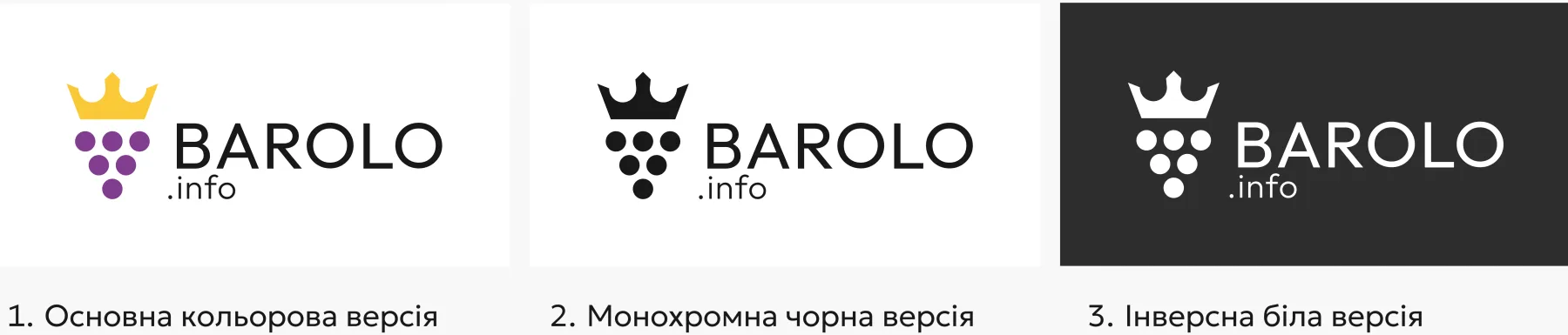
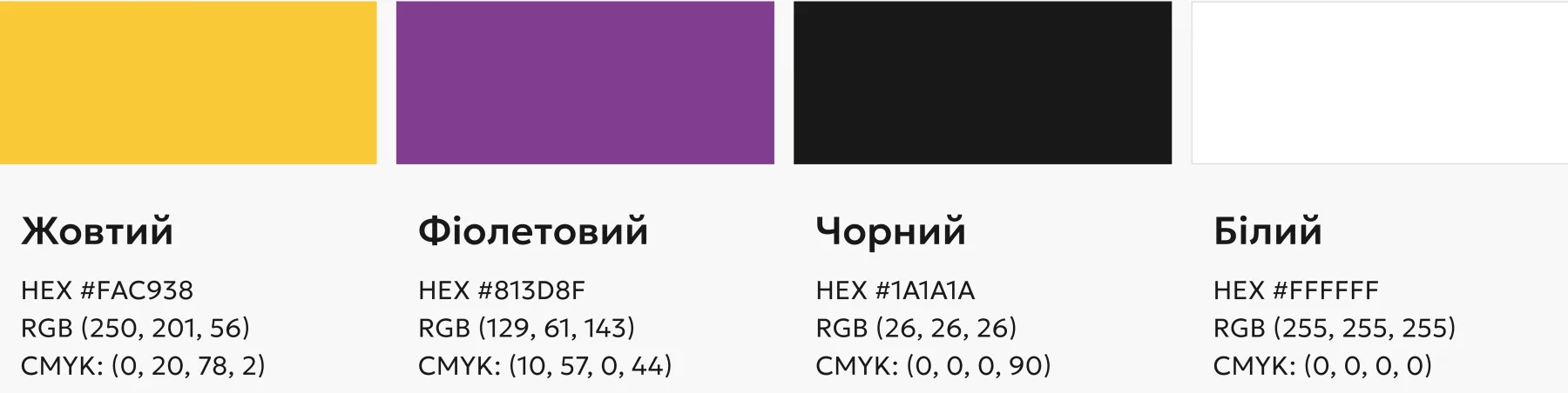
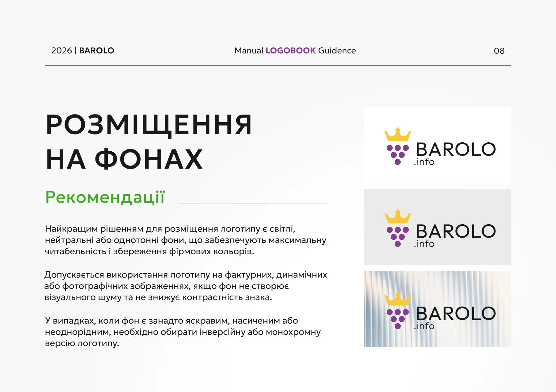
We deliberately moved away from the burgundy typical of the wine world. Violet reads as the colour of ripe grapes, yellow as the gold of the crown, and the black wordmark keeps legibility at its maximum. Monochrome versions cover print and technical materials.
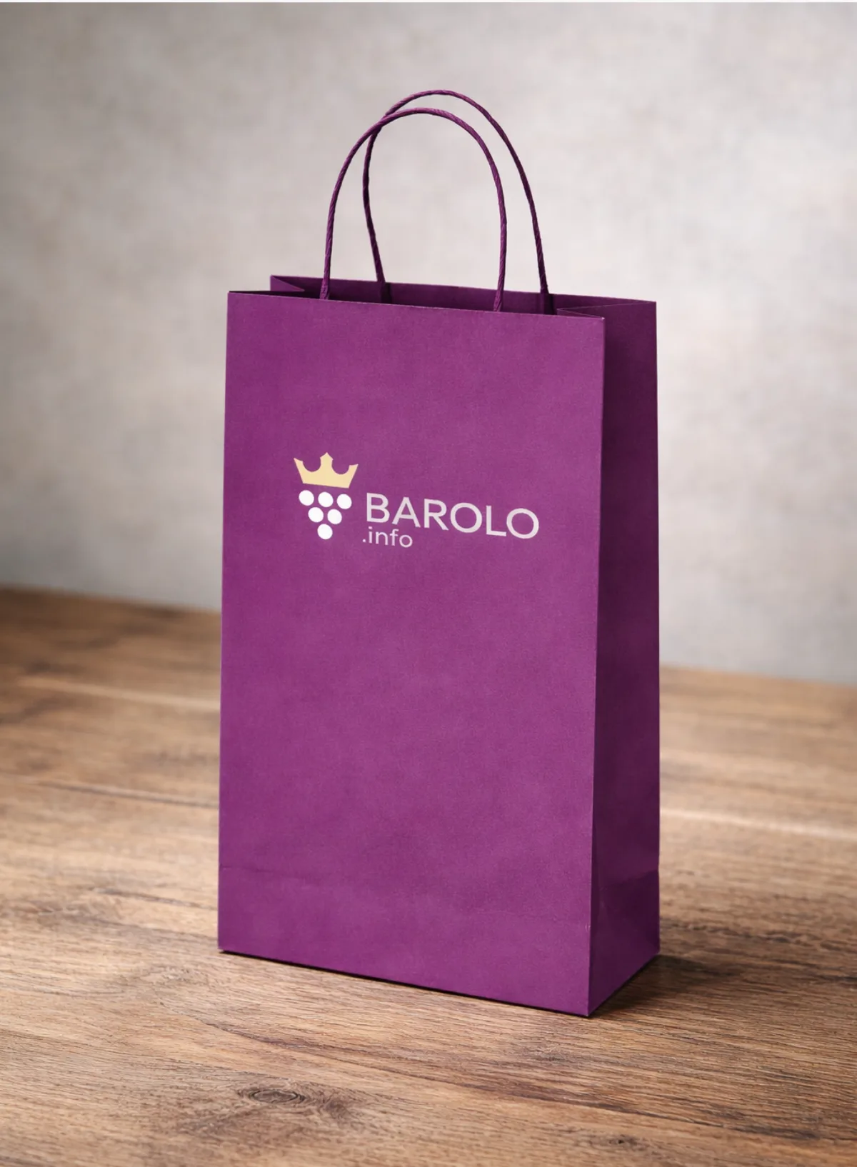
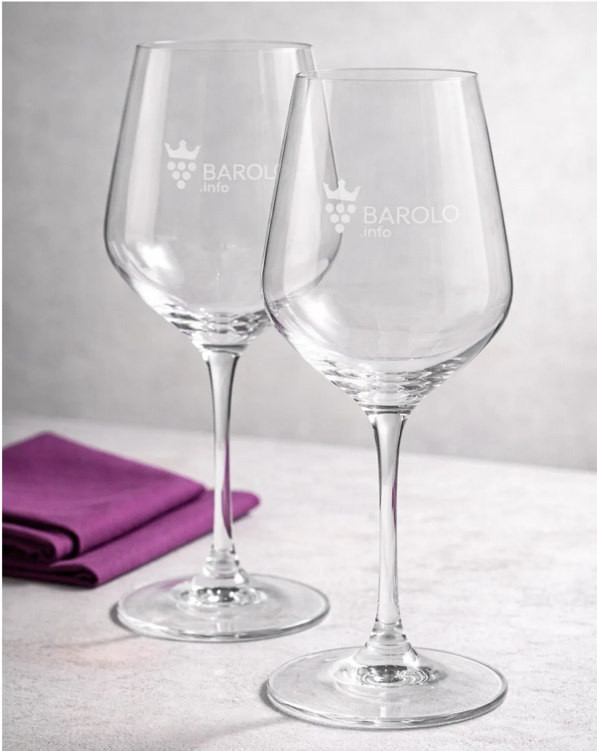
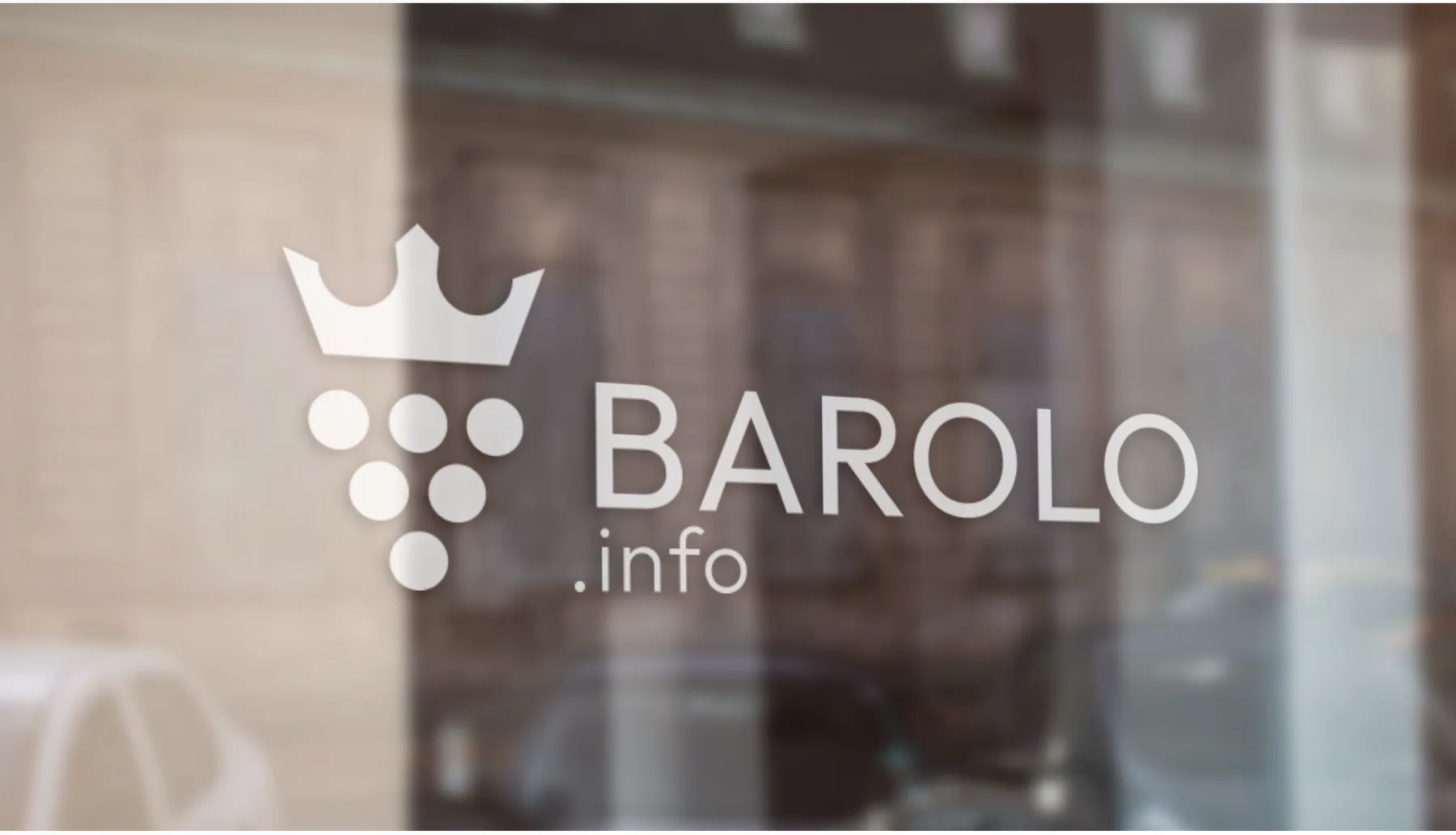
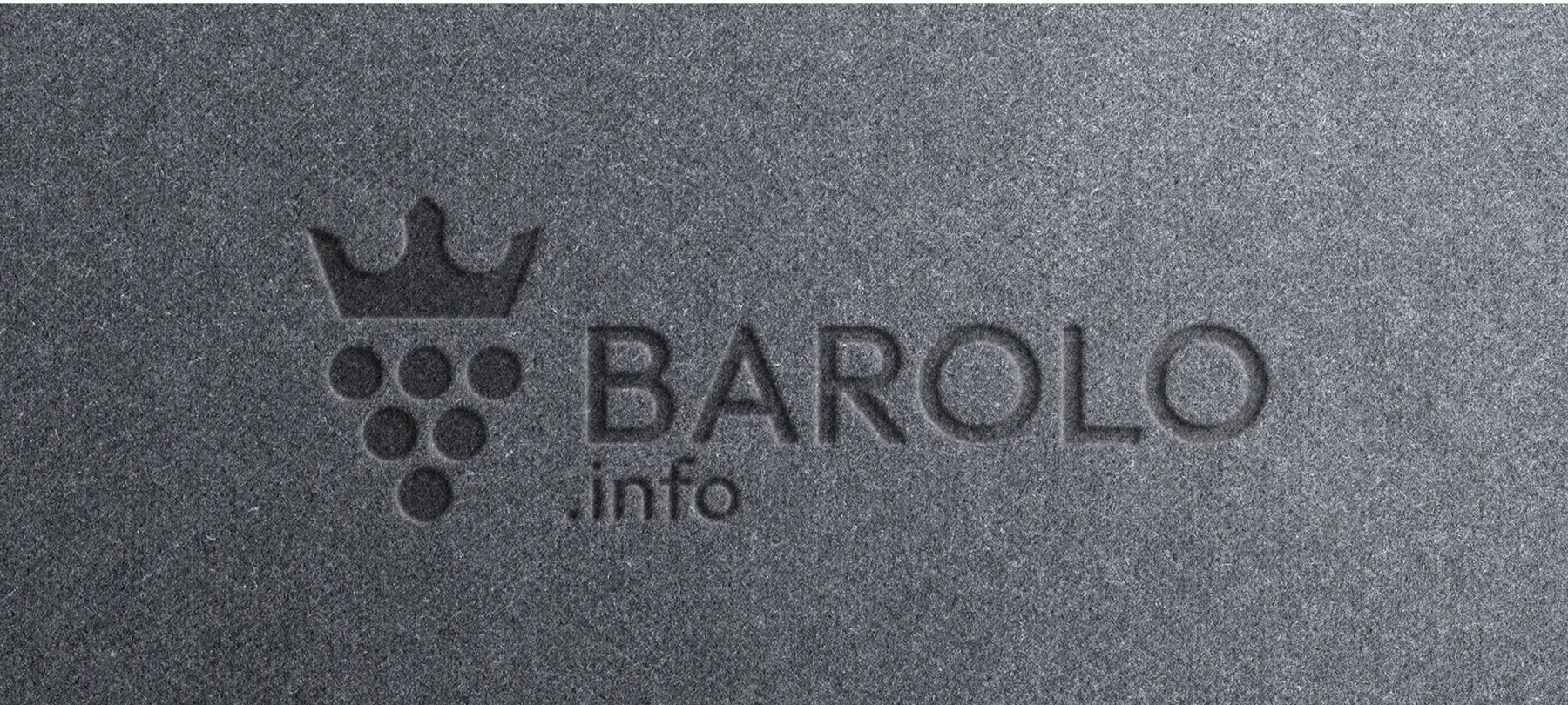
Wine of Kings, King of Wines. And a mark that looks the part.
(Contact)
Want the same? Let's talk.
Request sent
Thank you! We will get back to you within a day.